A Conversation with pastel artist and muralist, Deborah Shea
Deb Shea is a visual artist of floral wonder. Shea, a colorist currently working primarily with pastels, studied art and design at UC Davis where she began a career as a graphic designer. Shea worked in design and branding for many years before focusing her attention on her own art practice, which includes pastels, fiber arts, and public art murals. We conversed, with intermittent laughter, in her studio at Art Bias and then visited her solo exhibition, From Bud to Bloom, in the Art Bias Gallery.
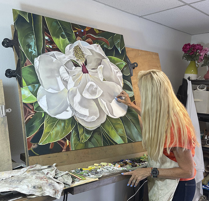
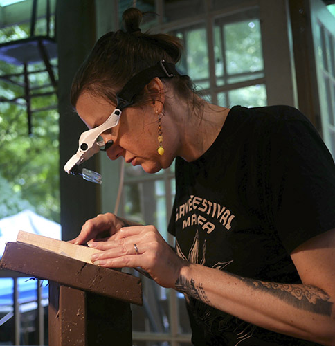
Deb Shea at work in her studio at Art Bias in San Carlos, California.
Nanette: Tell me about your background.
Deb: I studied studio art with Wayne Thiebaud and Roland Peterson. They were great. Thiebaud was an especially wonderful professor, and a very wonderful painter and colorist. I really enjoyed that quite a bit.
I had to work while in school to support myself. I had a scholarship and worked as a graphic designer to pay for my education. I did graphic design for several different agencies in the college: the newspaper, posters for Arts and Lectures, all that kind of stuff. I took that up as my career after I finished school. I was hoping to go to San Francisco Art Institute for graduate school, but I never had enough money. I was paying off my student debt for quite a while. So, I became a designer! I worked for a while in Sacramento, then I moved to San Francisco. I continued to be a designer, then an art director, and then a creative director.
I moved from San Francisco to the peninsula about 30 years ago. I worked for two or three software companies as a creative director. One was based in Oslo, so I was traveling to Norway quite a bit, and two other software companies. I had my own marketing business for about ten years. I was doing artwork as well but primarily designing, illustrating and branding—a lot of branding and identity work, for many kinds of companies.
Then the recession hit in 2008. So, my business really suffered after that. Marketing budgets kind of go by the wayside when you have a real economic crisis.
I started to work full time for a client for about five years. Being a creative director and doing all the illustration and design work for all their packaging.
Nanette: Was that Pamela’s?
Deb: That was Pamela’s. I worked for Pamela for about 25 years altogether. I first started freelancing for her when my daughter was born, and then slowly but surely, her company grew and grew. When I first met her, it was just her and her warehouse manager. So, we went through a lot together! After some years, I had enough of working for a small company and a lot of deadline pressure that was very stressful.
Then I had a bit of a health scare. I got over that but decided it was finally time to dedicate myself to my art full time.
Nanette: Were you engaged in your own personal artwork while you were having a design career?
Deb: I was.
Nanette: Has it always been pastels?
Deb: No. Previously I did a lot of acrylic work and collage work. I did take some courses at the Art Institute in San Francisco. It was wonderful. I did a lot of very large oil paintings and acrylic paintings in those classes.
Nanette: But now you work primarily in pastels?
Deb: Yes primarily. It’s a medium that I started working with for my illustration work, because a client was looking for an artisan feel to the packaging design. So, I started to do pastel drawings. My employer was paying for all my supplies. They said, “Buy anything you want.” That was great, because I got to use really nice stuff. Then I had deadlines, of course. So, I learned to really dive into the medium. I was enjoying it very much, too. That was fun.
Nanette: What is it about pastels that engages you?
Deb: I got some pastels from my grandfather went I was very young. I’ve always been very comfortable in drawing. I really, really enjoy the emotional quality of drawing. I think that was one of the reasons why I kept up with my artwork while I was a designer. There was such a great emotional attachment to touching things rather than working on a computer. I also love to do things in textiles, like knitting, and crocheting, and felting, and that kind of stuff, working with the paper flowers. . . I love making things. So, pastels, I’ve always loved their quality, the velvetiness of them, and the super beautiful colors.
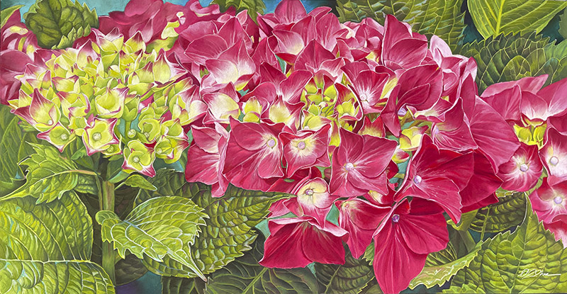
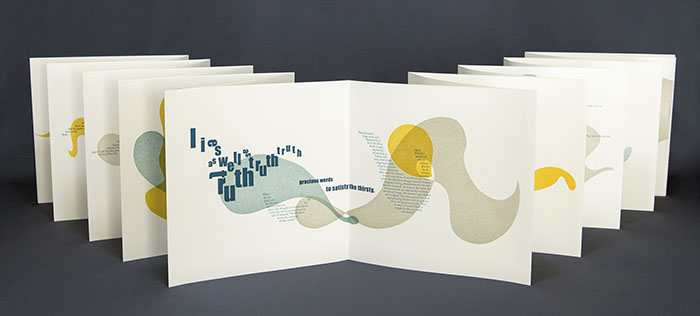
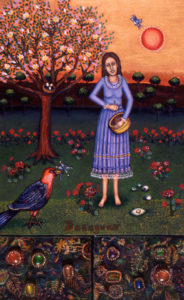
Love at First Sight, pastel on board, 28″ x 54″ by Deb Shea, 2026
Nanette: The tactile thing—do you feel like you can get your hands into the pastels more than you can with paint?
A Conversation with Katherine Bazak by Sharmon Hilfinger
Katherine and I were introduced to each other by a mutual friend over 30 years ago, when we were both establishing our creative careers while starting our families. Kindred spirits working in different métiers, we have shared our experiences as creative artists ever since. Her exquisite painting of Lucy Drawing graces our dining room and never fails to draw comments from people who see it for the first time.
Sitting down now, so many years later, to talk to Katherine about her career as a figurative painter and teacher has been a fantastic lesson in how to look at art. Talking with Katherine is like going on a tour of the painter’s process, exposing how the materials, color and composition reveal the artistic intent. She reminds us that great artwork is not accidental; it is deeply understood and performed by its creator. Katherine is exceptionally articulate with her paintbrush as well as with her ruminations on art and how it works.
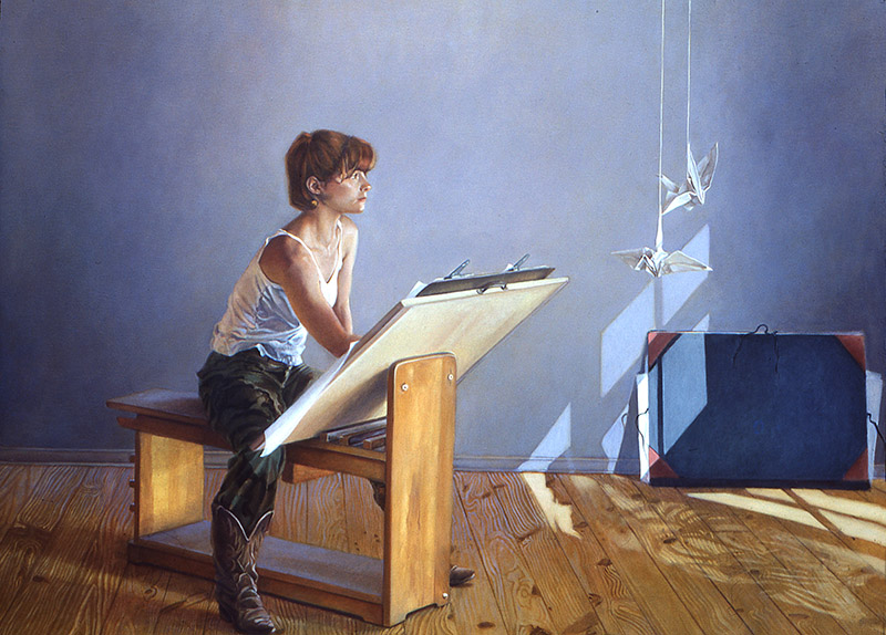
Lucy Drawing, Oil on canvas, 52″ x 72″ by Katherine Bazak, 1984–85
Sharmon: You and I grew up in the 1960’s and 70’s when the art trends were Conceptual Art, Minimalism, Pop Art, Psychedelic Art. But you have always been a figurative painter—a very fine one, I might add—so I am curious to know what influences and training led you to your personal style of painting.
Katherine: My visual education started at an early age. On Sundays, my father would leave my brother and me on the steps of the National Gallery in Washington DC at 9:45 a.m. before he would go to the golf course about 15 minutes away. We sat on the steps until the Gallery opened—nobody was worried about us, there were guards who knew us. This started when I was 10 years old. I wandered around the museum while my brother sat in rooms that had paintings of boats and read a book.
One of the first paintings I loved was by Mary Cassatt, a girl with a braid in a white outfit, and another Cassatt of a little girl in a blue chair. Another favorite was by John Singer Sargent called Repose. I spent a lot of time in the room with the Vermeer’s. I remember the painting of a woman with a beautiful jewel-like red hat.
I loved the Titian room! The Portrait of Farnese with the pink vest, Venus Holding an Apple, Venus and Adonis, the Portrait of the Doge—those paintings have been with me my whole life. There is something going on in those paintings—something behind the eyes of the people he painted. I could just look at those and know that the painting of Titian’s Doge was better than the other Doges in the room.
At that age I had no idea who these painters were! But by the time I left high school I had walked through every room at the National Gallery. For a visual person this was heaven.
Every once in a while, we would go to the Phillips Gallery that has a big pre-and-post Impressionist collection. That’s where I saw Renoir’s Boating Party. Some hear the name Renoir and think of peachy-pink people. I mean old ladies love Renoir. In the Boating Party—they’ll say, “he painted the light” which is a cheesy thing to say, but he did! When you see the Boating Party you can feel the wind, you can feel the sunlight. It’s a very evocative painting. It took me a long time to understand and respect this aspect of representational painting.
There are paintings that I just want to stand in front of and spend time looking at or revisit. Why do certain paintings interest me? I’ve thought about that a lot and now looking back, I realize that I have always been a ruminator. I love the way some paintings offer me a way to ruminate. All my paintings have something to do with that.
Macy Chadwick is the founder and director of In Cahoots Residency in Petaluma, California. Macy is remarkable as a creative residency host in part because she is exceptionally personable with a wonderful gift of giving a story, often with unpredictable humor and resulting laughter. Her own work as a printmaker and book artist is visually poetic and imbued with a sensitive essence of personal reflection. We talked about her work and the running of In Cahoots while sitting under a large oak tree on the residency grounds.
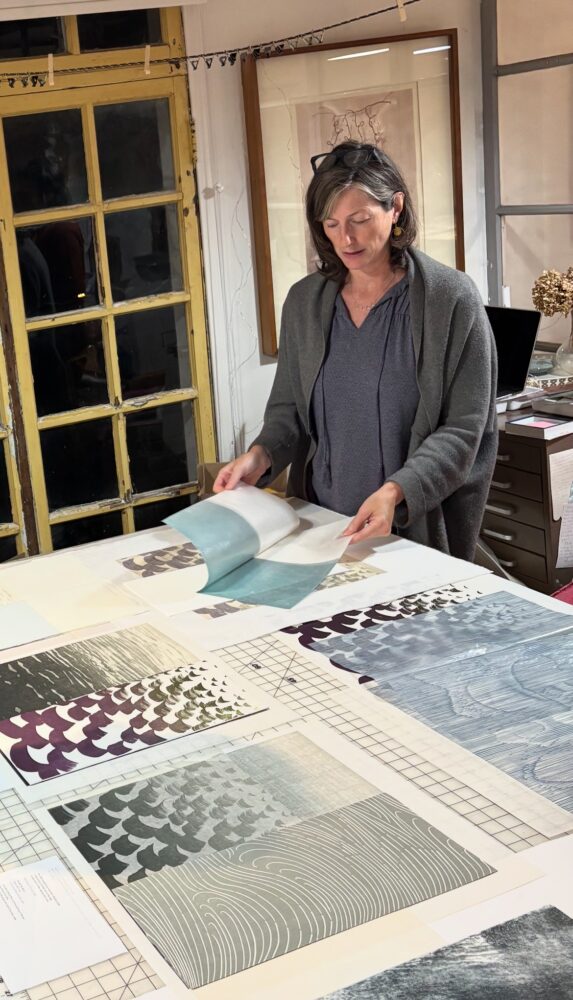
Macy Chadwick in the studio. Photo: Edie Overturf
Nanette: How did you come to art?
Macy: When I was little, I loved all kinds of art, and my mom really encouraged it. I took some after school art classes starting in third grade and continued with that until high school. In order to take the advanced art classes in high school, I had to commit to being an art major in college because the goal of the advanced art classes was to help you prepare a portfolio to apply to college. So I said, yeah, I’ll be an art major in college. Then I decided I really did want to do that. I pursued my BFA, but I was never one of the artsy kids. I didn’t have purple hair or tattoos, still don’t. But I was definitely one of the creative kids, and art has always been a big part of my life.
Nanette: How did you get into printmaking and book arts?
Macy: In undergrad, I was an Illustration major and I never really loved it. I had loved drawing in high school, because that was just what we were offered. In college, I started taking printmaking classes to do my illustrations and then I realized I was actually more interested in making prints about my own ideas and concepts than I was in illustrating other people’s ideas. So, I ended up being a double major in Illustration and Printmaking.
This was at Washington University in St. Louis. I was very interested in putting my prints into a sequence. At the time, they didn’t have book arts there, so I went to the library and checked out the Japanese Stab Binding book—the one with the green cover. I don’t know why, but that’s the only book on book arts techniques that every library seems to have. So, I learned stab binding, and I taught myself a couple of other bindings in undergrad.
Between undergrad and grad school, I took Book Arts classes at Oregon College of Art and Craft with Barb Tetenbaum. It was from Barb that I learned the foundation of everything I know about book arts and letterpress printing. I’ve learned more over the years, but Barb taught me so much. As happens with your first teacher—you still reference what they taught you, and who they admired. Barb admired Tim Barrett, Hedi Kyle, Patty Scobey, Julie Chen, and Gary Frost. So, I still admire all those people, and others, too. I continued to study Book Arts and Printmaking in grad school and then I learned more when I moved to Berkeley to work for Julie Chen.
Meanwhile by Macy Chadwick, Limited edition artist book: Letterpress, relief printing; accordion structure in half-clamshell box. Edition of 40, 2017. Photo: Bernhard Uhl
Nanette: When was that?
Macy: I moved to Berkeley in 2003. I had graduated from Wash U in 1994. The rest of the nineties I lived in Portland, Oregon. I studied with Barb at the Oregon College of Art and Craft, which has since closed. Then I went to grad school at the University of the Arts in Philadelphia, from 2001 to 2003. UArts closed recently as well.
Rebecca engraving at Jim Horton’s studio in Ann Arbor, Michigan. Horton gave Rebecca her very first lessons in wood engraving in 2013. Photo: Tony Drehfal, another master wood engraver.
Rebecca Gilbert is a printmaker’s printmaker—impressively knowledgeable about printmaking history, and historical and contemporary print processes. Rebecca astounds with her joyful commitment to a seven year long project based on Hans Holbein’s Dance of Death. Rebecca’s own dance demonstrates an insightful perception of humanity delivered with generosity, depth, and a fresh lightness of the creative spirit.
This conversation took place under a large oak tree during a summer printmaking residency at In Cahoots Residency in Petaluma, California.
Nanette: How did you come to art?
Rebecca: I pretty much always wanted to be an artist. Since elementary school at least. And I was actually just thinking about this the other day. I met my best friend in elementary school, Bobby Riefsnyder, on the first day of kindergarten. We would play together every day after school. I would pretend that I was an art teacher and he would pretend to be a music teacher. We probably played that every day for a couple of years, and it never got old, so I feel like I always knew I wanted to be an artist and I always knew I wanted also to be an educator. Even then, I thought of those as two different things that you could merge into one, and they are two totally different sets of skills. When I went to college, I started as an art education major, because that seemed like the most obvious way to pursue both. I don’t know what art education programs are like now, but at that time, I found that learning about art and making art weren’t very important in that major. All of the focus was on teaching, and art barely even felt secondary, so I changed my major to printmaking.
Nanette: As an undergrad?
Rebecca: As an undergrad, yes.
Nanette: And why printmaking? They actually had a printmaking major?
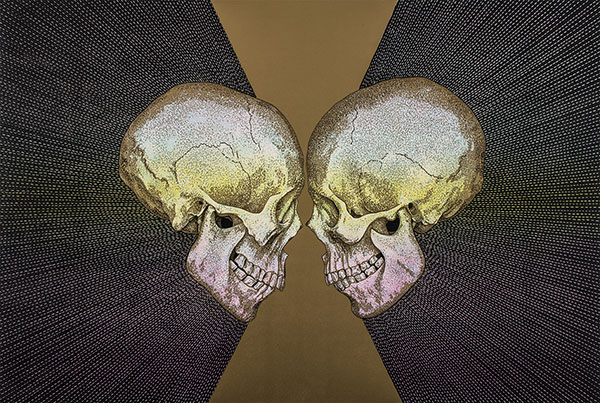
Memento Mori (Skulls) by Rebecca Gilbert, Reduction and multiple block color woodcut, 26.25″ x 37.5″, 2019
Rebecca: Yes. I made my first print in high school. It was a monotype. I was thinking about this recently, too. I forgot that monotype is what made me fall in love with printmaking. I was hooked after the very first one, and I very rarely make monotypes these days. My high school had one little press that they would wheel out of the closet every now and then so we could make some prints, and I loved it.
In college, I had taken a bunch of printmaking classes, even as an education major. Besides the process involved in making a print, I just love all the tools and gadgets and presses, and all the printmakers seemed a little dangerous, edgy.
Nanette: More edgy than the other artists?
Rebecca: Yeah, yeah. [laughs]
That was part of what initially drew me to it. There’s such a long list of everything that I love about printmaking that keeps me drawn to it now.
Nanette: So, you were a printmaker right off the bat?
A Conversation with printmaker Christopher Hartshorne
During the summer of 2025 Christopher Hartshorne and I worked directly across from each other, at a printmaking residency at In Cahoots Residency in Petaluma, California. We were each at lovely large etching presses where daily I found myself appreciating the gift of being able to observe his process of pulling richly beautiful, futuristic moons—a memorable highlight of my own residency experience.
When we noticed the local blackberries were in and ripe, Chris picked a bunch to bake us a blackberry crumble. It was almost as delicious as Chris’ prints.
This conversation took place towards the end of our residency in the etching studio.
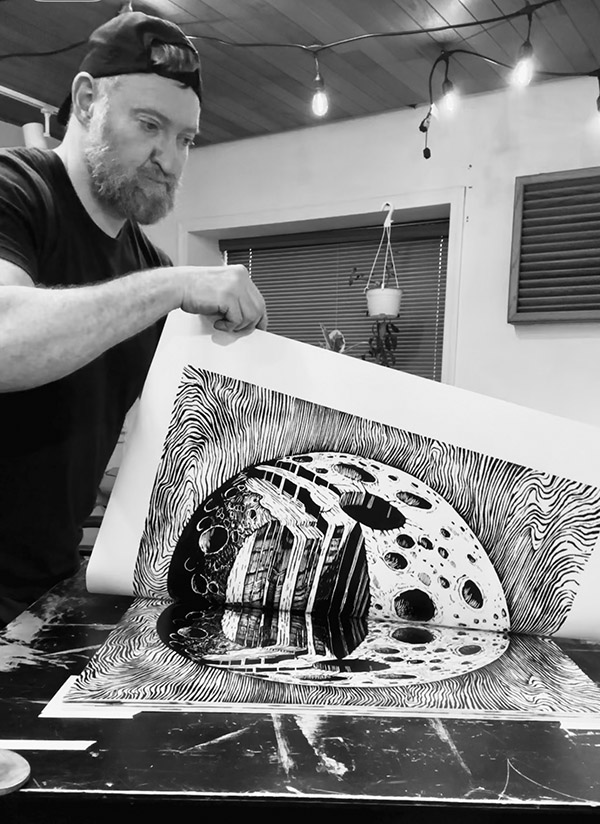
Christopher Hartshorne printing the Graphic Myths series
Nanette: How did you come to art?
Chris: I always made art as a kid. I was so shy, I didn’t try other things. Very introverted. It was like an escape, or something that I could do. And I got a lot of positive reinforcement as a kid. I was known as an artist as a kid. So I kind of stuck with it.
Nanette: Like drawing?
Chris: Yes, drawing. I’ve tried to do other things, but I always come back. I’m like, I’m an artist. I’ve got to keep making art.
Nanette: Why printmaking?
Chris: I was painting and I went to school for illustration, never did any printmaking in school, like in college, but when I discovered woodblock printmaking, I liked the process. It was a very definite process. You transfer an image, you carve the image, you print it, you kind of know what it’s going to look like, very graphic. A painting to me was too mysterious. Maybe I didn’t know how to paint. I was a painter, but I didn’t know when a painting was done. There was something really crisp and clear about printmaking and the way I was using it. I latched onto the process immediately. I loved how you could make an expressive, almost random mark on a piece of wood and it looked so defined and intentional when you printed it, because it’s so graphic and bold. That was really cool to me. The marks you can make and how bold they are compared to painting. But now I’m thinking of printmaking differently, actually. A print can be more mysterious, like a painting. So now my views are broadening. That’s how I latched onto printmaking, the process.
Nanette: How long have you been printing then?
Christopher Hartshorne: TempleGRAM, Multiple block woodcut installation, variable dimensions, 2019
Chris: Probably 20 to 25 years. I just started doing it on my own.
Nanette: After school?
Chris: Yes, I was hand pressing, with no community yet. I just started doing it and then kept doing it. I eventually went to grad school for printing, because that’s all I was doing.
Nanette: Many of the artists that I’ve met go in through painting, because painting is seductive and it’s elevated. It used to be, you were a painter or a sculptor. And that’s all there was for fine art. So I think it’s normal to go in through the magic of painting. What grad school did you go to?
Chris: I went to Tyler School of Art.
Nanette: How was your grad school experience?
Chris: It was good. I waited ten years in between BFA and MFA so I was older than everyone. I really wanted to immerse myself in printmaking and school for printmaking, but I actually did not really feel like going back to school. But it was good because they have a program in Rome, through the school, so the whole second year I was in Rome and it was more like a residency, which . . . why am I going to school if I’m just doing an artist residence? But it was really amazing. I would never have gone out of the country back then if it wasn’t for the program. It was my first time out and it was pretty cool. I had a small cohort of five other grad students from Tyler and a bunch of undergrads that were from a lot of different schools, just getting some international school experience. It was good.
I was scared to leave the country. I don’t know. I’m a homebody, but it was really, really amazing for me to leave, and see more than just the art experience.Just to see how other people live, non Americans, [laughs] was very good for me to see as an artist and a human, or an American, I guess, so that was pretty cool.
Sophie Loubere stands out as an artist invested in the conceptual nature of historical imagery while exploring materials and processes. She moves deftly through a range of studio practices — working with wood type on a Vandercook, hand working intaglio plates, exploring natural dyes, papermaking, creating multimedia installations, book arts, and writing. We met during a summertime printmaking residency at In Cahoots Residency in Petaluma, California. Our conversation took place in the etching studio towards the end of our residency.
Sophie Loubere giving a printmaking demonstration at the Bainbridge Island Museum of Art in Washington state. Photo by Laura Zander
Nanette: How did you come to art?
Sophie: I started in elementary school, and it was just something that I was good at. I started using chalk pastels, making pastel paintings, getting positive responses, and then I just kept on going. Eventually it was just one of those things where it just felt like it was what I needed to do, which I’m sure a lot of artists can relate to.
Nanette: Did you go to art school right after high school?
Sophie: I went to the University of Illinois at Urbana Champaign, and I was an art major. But while I was there, I was just feeling like the curriculum wasn’t really serving my needs, so I wound up transferring to Rhode Island School of Design in their illustration program.
I’ve always been interested in words and books and writing . So for a while, I thought that I would potentially become an illustrator. But then my interests just wound up being a little too noncommercial, a little too artsy fartsy, more interested in material, more interested in concept, and making artist books as opposed to illustrations for editorial and things like that.
When I went into the illustration program, I didn’t fully understand that the conventional commercial way of making money doing illustration would be to make illustrations for editorial magazines or for working in animation and designing characters for game studios and things like that.That just was not really where my interests lay. Then one winter session, I wound up taking a printmaking course, Painterly Prints, and I learned aquatint and monoprinting.
Sophie Loubere: Relics, Cyanotype, letterpress, archival imagery. Partial view of 20′ x 6′ installation of literary vignettes, cyanotypes, and audio and video based on historical research, 2022
After that I was really into etching. I spent my senior year mostly doing etching projects working on this extended sort of book project. After I graduated, I set up my own studio in Seattle. I was working as a graphic designer and publications manager at a nonprofit art school. I had a little studio and I wound up getting some grant money so I was able to get a little press. Then I basically just explored varieties of ways of doing printmaking. I was feeling a little bit frustrated because I didn’t have a conventional printmaking background because I hadn’t majored in it when I was an undergrad. I was trying to learn from books, YouTube videos. I taught myself how to mezzotint, and eventually I just felt like I needed some more specific background. I applied for grad school. I got into a grad school that had a pretty in-depth printmaking program and that’s where I honed both my practice as well as my printmaking skills.
Nanette: So you’re primarily a printmaker?
Sophie Loubere: Relics, detail
Sophie: At this point, yes. I’m open to making in pretty much any particular way. I have worked with fabrics before. I’ve done installation. I’ve done audio and video work to go along with the prints. But I think that primarily when I’m thinking conceptually, the majority of the time it winds up being a print in some way or other, and print doesn’t necessarily mean something that is like a letterpress print. I also have done things working with cyanotypes and alternative photography. I view those things as prints as well.
In my view, there’s a lot of different meshing that goes on between all these different artistic media. I would say that printmaking falls into a lot of different categories.
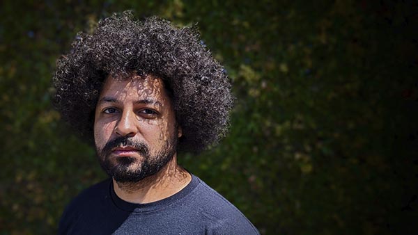
A Conversation with Sinjin Jones, transmedia artist
Sinjin Jones is a transmedia artist, storyteller, and poet interested in the connections between diverse media forms which allow him to combine these in interesting ways. In 2019, shortly before the reality of a global pandemic, Jones became the Executive Artistic Director of The Pear Theatre in Mountain View, California.
Sinjin Jones in 2024. Photo courtesy of The Pear Theatre.
Jones has a long history of engaging in live performance. From his student days until he moved to the Bay Area, Jones spent his summers working for A Theatre Group in Silverton, Colorado where he wrote, directed, and eventually became their Artistic Director and Vice President of their Board of Directors. He has founded a non-profit, multimedia artists’ collective called Otherworld Collective; and co-founded Perplexity Pictures, a film production company. He has a background in teaching performance arts at all levels, and is currently teaching for The Pear’s outreach programs. Jones has a Bachelor of Arts in Theatre, Film, and Video Production from the University of Colorado, Denver; and an MFA in Creative Writing from Regis University.
At The Pear, Jones is developing dynamic, engaging, and fresh programming that both surprises and challenges. His leadership consistently demonstrates his rich intellect and deep investment in local communities. We spoke over tea at an outdoor cafe on a lovely spring afternoon.
Nanette: How did you come to theatre?
Sinjin: When I was a kid I would tell stories to myself. We were very poor and didn’t have access to theatre. We would go to the dollar store and I would get to pick out one thing. I would pick out a [cassette] tape because my mom had a radio that also had a tape recorder. I would go into my room at night and tell stories to myself, improvised stories. That turned into getting together with the neighbor kids to tell stories. I would write stories and we would perform them. This was second and third grade, and I didn’t really know what theatre was, only to some small extent. Then my elementary school turned into a school of the arts and I got to take some theatre classes. I think that’s the beginning. I consider myself to be a storytelling artist, but that live act of performing in front of people or seeing story come to life in person has always interested me. That’s really the start of it all.
More formally, I did theatre in high school. I was deciding between archaeology and theatre/film for college. The University of Denver had a program where you could do theatre and film at the same time, so I was sold. The idea of storytelling is really beautiful to me. I’ve practiced a lot of different forms of art, many are less collaborative than theatre is. I like the coalescence of different artists from different backgrounds and different skill sets coming together to create one unified portrait of something.
Nanette: Did you grow up in Colorado?
Sinjin: I did.
Nanette: Denver has a really good art scene.
Sinjin: They do. I am very lucky. Downtown Denver has a ton of public art. In college, one of the assignments for one of my theatre classes was, “Here’s a map of downtown Denver. Go see as many of the public art pieces as you possibly can.” That is very lucky. It’s nice to have a lot of public art to experience and just be around.
Nanette: You demonstrate an immense amount of theatrical knowledge, and it is apparent by your presentations that developing a contemporary and engaging season requires broad and deep research. What is your process from seed to completed season?
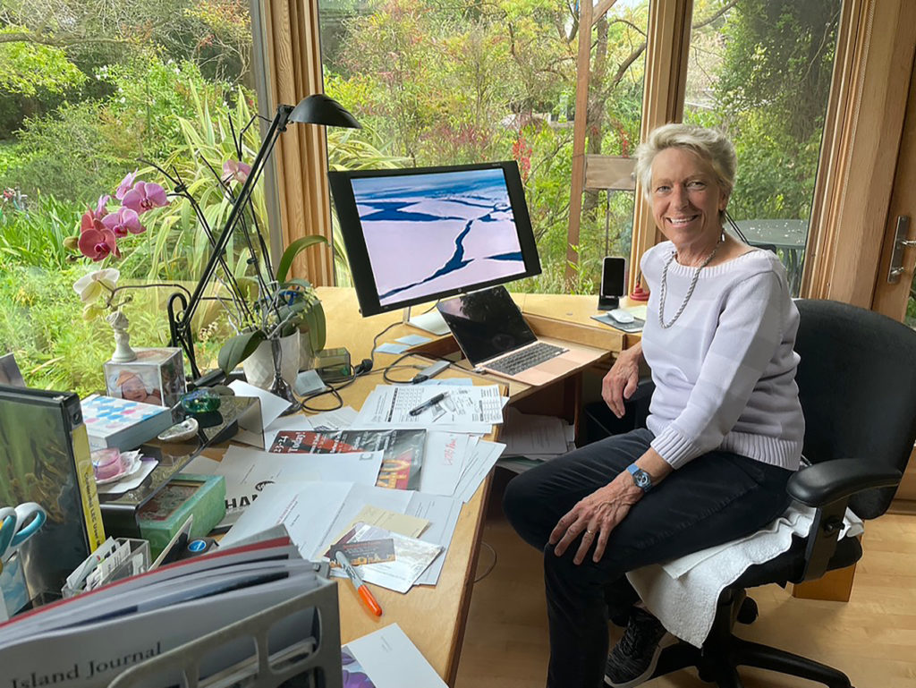
A Conversation between Bay Area playwright Sharmon Hilfinger and Katherine Bazak
As I sit across the table talking with Sharmon Hilfinger, I see the embodiment of two different women who are elegant, gracious, and intelligent. One is a wife, a mother, a musician; the other is an artist/writer committed to portraying her view of life and the world around her. As a playwright, she has chosen the theater to tell her truths under the guise of entertainment.
Theater is a tough art form to navigate. One must try to get their play off the page and onto the stage. It is impressive to meet someone with Sharmon’s track record. Her produced plays include three dramas and nine ensemble plays with music in collaboration with composer Joan McMillen. These have been produced by San Francisco Bay Area theatre companies, including The Pear Theatre, TheatreFIRST, Inferno Theatre, Menlo Player’s Guild, BootStrap Theater Foundation, as well as Heartland Theatre Company in Illinois. In 1998, she founded BootStrap Theater Foundation which develops and produces original plays by Bay Area playwrights.
Sharmon Hilfinger in her office. Photo: Katherine Bazak
Katherine: Let’s start at the beginning. I know that I saw An Ideal Mother some time in the early 90s. Was that your first play?
Sharmon: Well it was’t the first play I’d written, but it was the first play of mine that was produced. I read somewhere that The Menlo Players, at Burgess Park Theater in Menlo Park, was asking for scripts, so I sent it in. The director, Dean Burgee, called me immediately and it was produced in 1992. Beginner’s luck!
Katherine: Had you written anything before 1992?
Sharmon: I had been writing for a long time. I’m not quite sure how to say this—writing was my consolation prize for failure. I was an actor and I was admitted to the Conservatory program at Carnegie Mellon. It was, and still is, a University degree structured as a conservatory program, very unusual at that time. It was heaven! Theater classes all day, crewing shows at night—24/7 theater. It wasn’t easy to get in, and it wasn’t easy to stay in. They had a policy of accepting a certain number of students and cutting 10% of the class after the first year. It was very rigorous and class attendance was mandatory. I was there in 1970 when the Kent State Vietnam War protest killings happened. I cut classes to march on Washington D.C., which did not help my standing in the department. I’m sure there were other reasons (I was not given any kind of performance review) for why I was cut from the program.
That was traumatic! I was devastated. I came home and finished up my BFA in Drama at Illinois Wesleyan University in Bloomington, Illinois (my hometown). IWU is one of those gems of a good liberal arts college and had a very strong drama department. I grew up getting my theater education there because I went to all the plays they put on—the Head of the Drama Department was surprisingly avant-garde. I finished my BFA in drama, but I had it in my head that I couldn’t expect to pursue a professional career in acting, I was a failure, this profession was not for me. So I gave up theater! My creativity had to go somewhere, and I started writing instead. I wrote a novel, and a number of short stories over the following years. Whatever my day job was, I would get up at six in the morning and write before I went to work. First thing in the morning is still the best time for me to write.
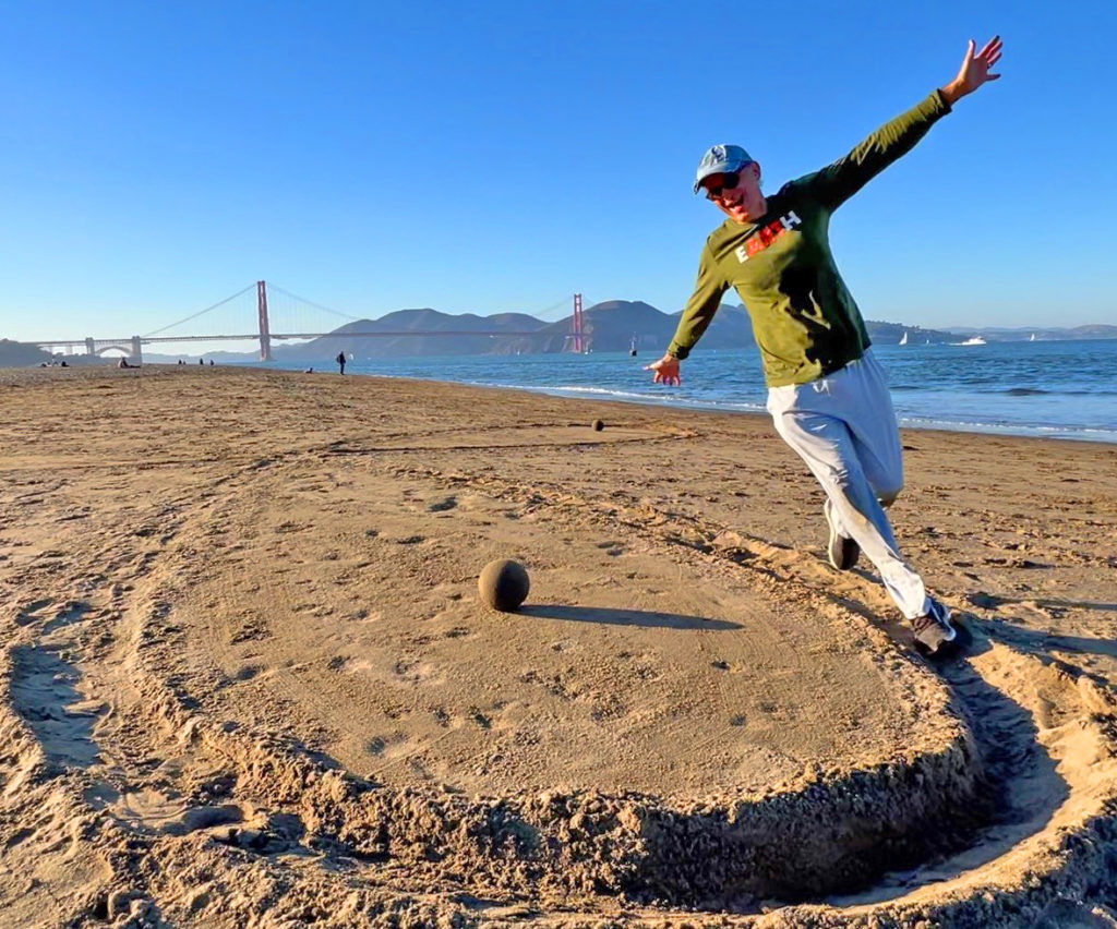
A few years back, Sam Bower and a few friends would gather every few weeks to think about the future of Bower’s greenmuseum.org. Its funding had come to an end. Was there some meaningful to way to keep it going?
I’d happened into this group about that time and it’s how I met Zach Pine. Although we never managed to come up with a saving strategy, it was always a special pleasure meeting with this group of creative dynamos. Our meetings would begin with a silent meditation and move on to brainstorming as Sam manned a whiteboard, sharpie in hand. After a few hours, we’d share some food. Our meetings went on for three or four years. In the meantime, occasionally I’d run into Zach at Karma Kitchen in Berkeley. Even so, I didn’t know a lot about him. He’d mentioned that he was involved with contact improvisational dance and had also been doing some art activities in nature with groups of people.
Zach running on a beach propeller with a sand globe decoration at Crissy Field East Beach, San Francisco
One day I began asking questions and soon learned that he’d been a doctor before I met him. I was stunned. It was hard for me to imagine that this open, lively, youthful and entirely unpretentious man had already been a medical doctor and had left the profession. But so it was. Later, I got a good look at his art. The time had come to ask for an interview.
Richard: Let’s start with your journey into medical school and your experience there.
Zach: I went into medical school for a lot of the reasons that I live life the way I do now. I was really interested in caring for people. I was very curious and had a scientific mindset. I wanted to get at real human things, and health and health crises were something I experienced up close as a young man.
Richard: Can you say a little bit about that?
Zach: My girlfriend got quite ill right after I met her in college. Now we’re married. I had a lot of experiences with the medical field because of that. I saw the science and humanity in it and, at that point, I decided to go premed in college. Before that I was an English and Physics major, so I already had diverse interests. My father and my stepfather were both experimental physicists. My mother is a painter, and also went to the High School of Music & Art in New York City, and did a lot of drama work.
Richard: You lived in New York then?
Zach: I did, but not as a child. I actually grew up in California with my mom. My parents divorced when I was two.
Richard: Both your father and stepfather were experimental physicists. What does that mean, exactly?
Zach: In the world of physics, there are two main branches, experimental and theoretical. The experimental physicists are the ones who actually design the experiments to try to find out how things work. My father and stepfather both worked on all the atom smashers here in the U.S.
My youth was spent, in the summers, going wherever my dad was doing experiments. He would go and experiment with something that took months to run. Stanford, Brookhaven National Laboratory, those are places that we went because there were accelerators there. So I was interested in physics and in the humanities in college. I realized that medicine actually combined a lot of the things I was interested in, and I had personal experience with what it felt like to be on the receiving end of medical care. I saw there was so much opportunity for ways of being creative in delivering care and, also, understanding medical problems. That was how I got interested in medicine.
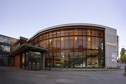
Cynthia Sears in the Sherry Grover Gallery at BIMA.
Cynthia Sears is a creativity explorer and the founder of the Bainbridge Island Museum of Art (BIMA) on Bainbridge Island in Washington State. She is known for her extensive support of artists, writers and cultural entities. Her collections include paintings and sculptures; antique and finely bound books; and some 1800 artist’s books, which comprise the Cynthia Sears Artist’s Books Collection at BIMA.
A pioneer in cultural support, Sears has collected and donated numerous works of regional artists to BIMA, creating a rich legacy of Pacific Northwest artistic production. Her wide ranging appreciation of the arts is demonstrated in BIMA’s community-centered mission and diverse programming which includes musical and theatrical performance; hands on educational activities; lectures, tours, and a wide array of community outreach events including an online series Artist’s Books Unshelved. This year BIMA is launching four generous biennial awards to support both regional artists and an artist making books. These BRAVA Awards (BIMA Recognizes Achievement in the Visual Arts) are in celebration of the tenth anniversary of BIMA in 2023, and a further expression of Sears’ belief in the value of the arts to human existence.
We conversed via zoom over a span of four months, discussing a range of subjects which touch on aspects of Cynthia’s life and thinking, including her work in radio and film, social and environmental issues, collecting and philanthropy, education, and the arts.
Bainbridge Island Museum of Art. Photo by Art Grice.
Nanette: What is your background: growing up, education, early careers?
Cynthia: I spent my childhood in Beverly Hills. I went to public school through eighth grade and then to a girls’ boarding school in Virginia, Chatham Hall. I was actually relieved that I wasn’t going to Beverly High because the girls that I knew in 7th and 8th grade who were going there were so much more sophisticated than I was. They were very concerned with boyfriends and convertibles and cashmere sweaters. . . they were already like late teenagers. I wasn’t ready for any of that. The idea of going off to a place where you had lessons in the morning and then rode horses in the afternoon was heaven. My older sister went to Chatham first. I couldn’t wait to go because I met many of her friends, whom she would bring home during vacations. They were great, interesting girls, so I couldn’t wait to go. Going to that boarding school was one of the great experiences of my life.
Then, I went to college at Bryn Mawr in Pennsylvania, also a small institution. The entire student body was only 750 girls. It was out in the country and beautiful. I just loved it. It looked like a medieval fortress—towering gray stone buildings which were built out of mica schist which catches the light so that it sparkles in the sun (I learned in my geography class).
I studied English Literature and Latin. I was sure I was going to be a writer. Well, that didn’t happen, but I was convinced of it when I was in college. I had a wonderful experience with terrific people.
Bainbridge Island Museum of Art. Photo: Art Grice.
Nanette: What happened after college?
Cynthia: After college I got a wonderful job teaching in the Bronx. I was a teacher at the Hoffman School. It was a school for kids who didn’t exactly fit other places, either because the child was super intelligent and could get bored in a regular classroom, or kids who had physical or mental challenges. They were all mixed together in the classes and it really worked. It was extraordinary.
I was hired as a Latin teacher. I taught Latin to second through sixth grades. We made Latin books and grammar books. They would say things like, “If the verb goes at the very end, how do you know who is doing what to whom? Maybe you make sounds so that you know this is the person who is doing the throwing and this is the thing being thrown.” They basically invented the accusative case.
A Tale of Two Remarkable Women: Conversation with Kathleen Canrinus, the author of The Lady with the Crown: A Story of Resilience by Helen Gibbons
Bay Area native Kathleen Canrinus wrote The Lady with the Crown: A Story of Resilience to honor her mother, Dorothy. When Kathleen was 15, her mother suffered a traumatic brain injury in a car accident. After three months in a coma, Dorothy emerged partially paralyzed and cognitively impaired, upending the life of her family.
Photo of Kathleen at work in her small office. Behind her is a painting by her father, who took up oil painting after retirement, immersing himself in it much as Kathleen has immersed herself in writing. Photo: Don Anderson
Kathleen’s memoir focuses on the relationship between mother and daughter, particularly its evolution during the 54 years between Dorothy’s accident and her death at age 99. There were plenty of challenges, but also lots of laughter and, oh, so much love. It’s a story I will enjoy reading again and again, finding some new insight or well-crafted sentence to relish each time.
I met Kathleen in 2006 when we both joined the World Harmony Chorus in Mountain View, California, and our conversations over the years have focused mostly on music. I wanted to learn more about Kathleen’s writing life and in particular The Lady with the Crown. We exchanged some emails and then sat down to talk. Our conversation is edited and condensed.
Helen: When did you start thinking of yourself as a writer?
Kathleen: I came to writing late in life, that is, after I retired from teaching elementary school. When I signed up for my first writing class, I had in mind writing stories from my life and wanted to tell them well. Even though I have now written a book that was published, and numerous personal essays too, I still hesitate to introduce myself to a stranger as a writer. But as far as thinking of myself as a writer, that came in the first few years of writing seriously, when I discovered that I was a person who noticed and remembered things, that I could write an occasional beautiful sentence, that I had a sense of how to shape a story, and most importantly, that finding words to match experience brought with it a thrill like nothing else. Writing lends meaning and purpose to my life. I like the Joan Didion quote: “I write to find out what I’m thinking.”
Helen: How did The Lady with the Crown come to be?
Kathleen: The Lady with the Crown evolved from stories I wrote about my mother over a decade in various writing workshops and classes. My mother had a remarkable attitude about life in spite of epic reversals. She was funny too—good material. I was never writing about her for family alone but for people like my classmates and possible future readers who didn’t know her. I intended to honor her and others who live small lives with dignity and courage. Although I wrote about other topics like friendship, marriage, and aging, the response to the mother stories was the most positive. I planned to string them together in a book and had finished most of them when the editor at a small press offered me a contract.
Helen: What a great opportunity! What happened next?
Kathleen: Next I spent nine months finishing a manuscript. Everything I had already written needed to be revised and new chapters added to complete the story. My editor made a lot of suggestions that improved the book.
Helen: Can you share examples?
Kathleen: When I originally thought about doing a book, I thought I would take the stories I had written about my mother and link them very loosely, like the stories in Olive Kitteridge [a novel by Elizabeth Strout that is a collection of interrelated stories]. I thought that approach would make my task easy. But when I told the editor, she said, “No, no, no! Make it one story. And whether you like it or not,” she added, “you’re the main character. You need to put yourself into this story; you’re not just the witness.”
Elizabeth Gómez is a Redwood City based artist and children’s book illustrator. Part of Gómez’s practice involves designing and managing community participatory murals in both paint and mosaic.
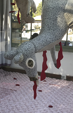
I first met Elizabeth during her July 2021 Redwood City Art Kiosk exhibition. Her installation, Naturaleza Muerta, was striking in the manner it pulled the audience in and then held their attention with an edgy softness: A lifesize deer and mountain lion hang upside down in the center of the kiosk. They are accompanied by a squirrel and a crow. These hand sewn creatures are made from pale, low contrast fabrics. Scatterings of thin red cloth trail from each body. The kiosk floor is covered with pink quilting and a spare grid of deep red, fabric roses. There is a feeling of being in a child’s bedroom. These layers of symbolism reveal a multi-dimensional philosophy about the relationship of humans to other animals, to profound effect. In this work Gómez brings together a blend of Louise Bourgeois construction with Sue Coe content to make her own statement about real life events involving wild animals in our suburban neighborhoods.
Gómez has an MFA in Pictorial Art from San Jose State University. She has shown at the deYoung Museum in San Francisco; the Oakland Museum of California; MACLA in San Jose, California; and at the Mohr Gallery in Mountain View, California.
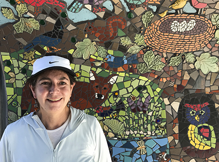
This week Gómez’s most recent mural, created with the help of many from our community, will be unveiled at the Magical Bridge Playground in Redwood City. We spoke during the last weeks of mosaic tile making under the redwoods and oaks on the back patio at Red Morton Park, the mural’s home.
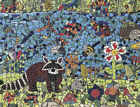
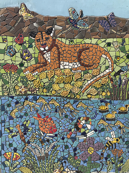
Magical Bridge Playground mural, 2021
Whirligig: Let’s talk about your background. You went to San José State?
Elizabeth: I did most of my college in Mexico City where I am from. I did three years at the San Francisco Art Institute and then I did my masters in painting at San Jose State. I had great professors like Erin Goodwin-Guerrero and Rupert Garcia. It was an excellent program, lots of support, really nice.
Whirligig: How long have you been working in mosaic?
Elizabeth: I have been doing small things here and there but I am really a painter. I have been working with Redwood City for many years. I have done murals in the schools and parks. The city knows me as an artist that can create and facilitate public works with volunteers, with the help of the community. That is why they asked me to do this mosaic mural. I have learned a lot doing this.
Whirligig: What are the dimensions?
Elizabeth: It is gigantic. It has more than 700 square feet of tile.
Whirligig: You did the design?
Elizabeth: I did the design and many workshops. For example, here in Red Morton Park during the pandemic we were outdoors and indoors and outdoors again and then we couldn’t do it at all. Then, I had to transport boxes of materials to the volunteers, house to house, I would bring a new box and take competed work away. I did that for many months. It was a lot of work. Then we were allowed to work here outside again, almost a year and a half after we started. The hardest thing about this project has been the management. We have had more than 750 volunteers on this mural. Everybody is welcome. I have taught the class on how to make mosaic shapes hundreds of times now. I will be happy to see it on the wall.
Whirligig: You plan to install next week. . .
Elizabeth: We have two walls and a tunnel. We are hiring professional tile installers because it is so big and heavy. I will be there as support. I don’t know what problems we will encounter, but we will have problems. We already fixed a few things–the walls were uneven and there was an anti-grafitti sealant on one wall that would not allow the tiles to adhere, so we had to remove that.
Orange Halves
Whirligig: Tell me about your painting work.
Elizabeth: My work belongs to the Mexican tradition. I like surrealism. I like animals and nature. I like a lot of handmade patterns and decoration. I have been working on a collection called Madre Tierra (Mother Earth). They are women with the face of an animal. Very surreal. They represent the need to care for the environment. The most recent is Mother Earth Crow. She is signaling with her wings the end of the wilderness, saying “From here to here is wilderness, so you don’t build. And from here to here is for humans, so stay on the human side.” They almost look religious. They are big animals with dresses, in nature. One is Vindictive Mother Earth. She has humans in a cage. Bird Mother Earth is teaching little birds how to protect themselves against us. But all very beautiful and colorful, filled with flowers. Mother Earth Wolf is planting flowers on the pavement in Mexico City. She is taking care of them with a watering can, a nurturing Mother Earth.
Whirligig: Those are in acrylic, oil?
Elizabeth: I love to paint old style, oil on wood, because with painting in glazes it becomes very jewel like and medieval. You can touch the colors.
I’ve also illustrated many children’s books. I just finished a book on El Salvador, ABC El Salvador.
Crow Mother Earth at the Edge of the Wilderness
Whirligig: Are there specific artists you are inspired by or look too?
Elizabeth: Sometimes I am a bit sad that the person most known here is Frida Kahlo. When you see Frida’s work it’s not only Frida’s style, but it is Frida’s style on top of the Mexican tradition. Her work makes a lot of sense within Mexican art. When she was painting there were a lot of women painting. For example Leonora Carrington and Remedios Varo. There was a magical group of women painters that had this surreal, folksy, decorated, colorful work. I really like their work. Because I grew up in Mexico City it was normal for me to visit Frida’s house or see a show of Remedios Varo and other artists from that time. I don’t try to do what they do, but I like the visual language they were using. My own work is always about nature and the environment.
Whirligig: Would you say that you are mostly inspired by female artists?
Elizabeth: I would say that I really like their quality. I don’t want to generalize, but with Mexican women artists there is something that is, to use a trite word, feminine–care taking, nurturing and smaller–that I like. The famous male Mexican artists are very grandiose, “Industrialism came to save us! The workers will save us!” Full of big ideas, but with little heart. I like works with more heart. I am not saying that men cannot do this, just historically in Mexico it has been the case that women pay attention to heart.
Lion Fountain
Whirligig: You exhibited sculpture in your Art Kiosk show.
Elizabeth: I do a little bit of everything. I have created three installations with ideas of nature and animals. At the Oakland museum for the Day of the Dead I showed dead animals. I made a coal circle . . . where it is clean the animals are alive and flying. Where it is dirty the animals are dead.Â
Whirligig: What is it about working with animal symbolism that you hope to communicate?
Elizabeth: I sometimes feel that we humans do not believe that animals have the same right as us to be here. That we are more than they are. That we own this place. After all of the facts telling us this is not the case, global warming. . . I want to be a voice for animals, even if it is a small one, saying “We are here. We belong. This is also our earth.”
Whirligig: So you grew up in Mexico City . . .
Elizabeth: Yes. I did most of my formative years in Mexico. I came here after I got married. I have been many years now here in California.
Whirligig: How is it to be an immigrant here in California?
Elizabeth: Sometimes it’s good, sometimes not so much. Especially if you are from Mexico. My husband is from Argentina and he does not cross too many people with stereotypes about what an Argentinian is. Maybe they know about the tango. . . But if you are from Mexico the stereotypes are very, very, very strong. Sometimes when I encounter someone who knows only that I am from Mexico and nothing else about me, I feel discriminated against. For example, people who don’t know me immediately assume that I am not educated. They talk to me as if I didn’t know things. This actually happens a lot. I am not saying that everybody needs to be educated, but oh my gosh, they speak to me in such a way that I want to say, You know I have a graduate degree you don’t have to talk to me as if I don’t understand things.
Whirligig: Because of your accent?
Kelp BallerinaDesayuno
Elizabeth: My accent for sure, and then they ask me, Where are you from? And I say, Mexico. In my life in California I have been hired at least three times as a babysitter. I would be with my children and they [some stranger in public] would assume I was a nanny. It was hard for me to convince these moms that I was also a mom and not the nanny. They would ask questions like, “The children speak Spanish to you?” And I would say, Yes. Then they would say, “That’s wonderful. Other nannies I know speak Spanish to the children but the children do not speak Spanish back. Do you have a driver’s license? How much do you charge?” They would be so surprised to find out I was the mother and not the nanny. Some assumptions are stronger than you think. In daily life doors can close easily because people have very strong stereotypes about what a Mexican is. I moved to a new neighborhood and the next door neighbor told me, “I don’t want to be discouraging but Mexicans are moving here. . .” Things like that happen here and there and everywhere. It always surprises me because most people are nice and good. But those who are rude and not nice. . . they don’t know me, I don’t know them. . .
Whirligig: Part of it is being a woman. . .
Elizabeth: Yes. But why don’t they just ask me what I think rather than thinking I don’t know anything? Sometimes people start sentences like, “Here in California, we. . . ” immediately making me the other. I’ve been here 30 years. I can say, We in California. . .
I like so many things about Northern California, but when I face those discriminating people I don’t like it.
Whirligig: I’m sorry that is here.
Naturaleza Muerta, at the Redwood City Art Kiosk
Elizabeth: People don’t know that if you have an accent you are asked a lot, Where are you from? How long are you staying? If it were a neutral question . . . but when you are asked that on a weekly basis it makes you feel as if you don’t belong, you don’t belong, you don’t belong. It makes you feel there is a wall around you everywhere you go. Now when they ask me, I ask them, And where are you from? Tell me about. . . We all are from somewhere, even if we didn’t cross a border. I try to be light about it but I wish it wasn’t the case.
Whirligig: You’ve been working on a two plus year project. What will you do after?
Elizabeth: The park has asked me to make some individual animals. It will be only me in my studio. I will have control of everything. I am looking forward to that. Then I will paint. I have loved doing this, but it was a lot of heavy lifting.
Whirligig: It’s an important project.
Elizabeth: I love that we have so many community members taking part, and also, if someone came to a workshop and made a piece of the mural, it is included. I didn’t get rid of anything the volunteers created. I kept my promise, that “if you learn to do it, you are a part of the mural.”
Whirligig: Do you think there was anything in your upbringing that made you particularly tune into non-human animals?
Elizabeth: My grandfather was a farmer. He could barely sell his cows because he loved them. He named them and the chickens and the pigs. When buyers came to take them, he had so much trouble. They followed him like dogs. He was a bad farmer in that sense. I think growing up with him I fell in love with the animals just like he did. Growing up in Mexico City, nature was so devastated by pollution, 20 million people in one city.
One day, everywhere I went, there were dead birds. Something was happening in the air or poison. Walking to school that day was one of the most important days of my life. I realized it was not a normal day. This was human induced. I think I became an environmentalist that day. Later we heard it was a paper factory that did not have proper air filters. They polluted the air. The birds died. . . It really welded a before and after for me.
Whirligig: Do you have a spirit animal? Is there a particular animal you are closest to?
Elizabeth: Not really. I strongly believe the earth would be better off without us. We are the extra animal.
Whirligig: Agreed.
Magical Bridge Playground mural, 2021
Elizabeth: Even sharks and insects have a right to be here. I’m a little bit of Buddhist in that sense. Everything that is living has a right to be here.
What makes me really happy is that I have found many paths to follow and they have taken me to incredible places that I never thought I could go or do. My parents were very sad when I told them I wanted to be an artist. But I am so happy that I am. A perfect day for me has art and nature. I have lived my life like that. And Northern California is a beautiful place and people respect nature here. People are also more open. I know that the Bay Area is the right place for me. Here I can blend in. California has a very nice collection of Asian art and Latino art and Californian art and good food.
Whirligig: How are you feeling now that the mural is up and complete?
Elizabeth: It was a tremendous amount of work. I am exhausted. I am happy.
Whirligig Interview by Nanette Wylde. All images copyright and courtesy of Elizabeth Gómez. Elizabeth Gómez’s website.
A Conversation with Interdisciplinary artist Minoosh Zomorodinia
A Week Living Art, 2015
Minoosh Zomorodinia is an Iranian-born interdisciplinary artist and curator working in time, space and the natural world. Her current art practice involves nature walks which are documented via smart phone app. The resultant maps are then made tangible via a variety of both old and new technologies. There is an edgy, accessible humor in much of her work, this she calls “the abstract absurd.” actuality, Zomorodinia uses all aspects of her making to parse and comment on current critical issues including borders and territories, colonialism, immigration, culture and identity, stereotyping, relations of the self to the environment, the power of technology, and the art world itself. Her work is both layered and engaging—smart, funny, and often visually exquisite.
Zomorodinia earned an MFA in New Genres from the San Francisco Art Institute (SFAI). She has a Masters in Graphic Design and a BA in Photography from Azad University in Tehran. She is the recipient of a Southern Exposure’s Alternative Exposure Award, a California Arts Council grant, and a Kala Media Fellowship Award. She has received residencies at Headlands Center for the Arts, Ox-Bow School of Art and Artists’ Residency in Michigan, I-park Foundation in Connecticut, Local Language Residency in Oakland, Santa Fe Art Institute Residency, Djerassi Residency in Woodside, and Recology in South San Francisco. Zomorodinia has exhibited locally and internationally. She volunteers for Southern Exposure Gallery’s Curatorial Council and is a board member of Women Eco Artists Dialog. Zomorodinia currently lives and works in the Bay Area.
We spoke in the studio at Recology, where Minoosh is resuming an artist residency interrupted by the COVID-19 pandemic.
Integration with Nature, 2010
Nanette: A great deal of your work has a focus on the body in nature—often your own body which is shrouded, wrapped, blanketed, responding to external elements. Why the body? Why your own body?
Minoosh: There are different reasons to use the body in my work. First, I want to acknowledge that my friend, Tara Goudarzi, generously accepted to be a model for the Destruction of Nature, Destruction of The Human Being as we were traveling together.
One reason to use the body is expressing self. I spend a lot of time in nature, it’s an extraordinary experience and inspiration for my practice. My mind opens and I see things when I’m in nature. I search for spirituality in nature and some sort of psychology for finding positive energy. I have been wanting to illustrate this feeling in different ways.
Another reason is to dematerialize and use my body as a signifier to lived experience as well as illustrate identity. I believe using my body offers a variety of contexts and perceptions. Employing my body in my work somehow represents time and space, especially in my performance installations. I consider my body as a sculpture—I make myself vulnerable to challenge the perception of the female body, and represent culture and religion. I want to emphasize a political perception from a Muslim woman’s body and how it’s been interpreted in the world.
Nanette: Are you thinking of specific interpretations of a Muslim woman’s body? Can you explain?
A Conversation with Ever Rodriguez / La Feroz Press
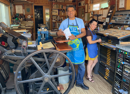
Ever Rodriguez and Gabriela Valencia in the studio of La Feroz Press.
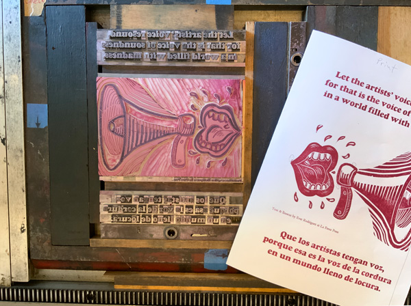
Ever Rodriguez was born and raised in Mexico and has lived in California since the early 1990s. He writes prose and poetry on themes related to his experience, including immigration, biculturalism, music, language and nature. Ever is a pragmatic writer for whom the common becomes the special as a way to contrast the abject against the normal. His education includes a B.A. in Spanish Literature and a M.A. in Library & Information Science from San José State University. He has worked for the Stanford University Libraries for the past 25 years. Ever’s letterpress studio, La Feroz Press, focuses on handmade editions with original texts and translations. His work often has the intention of amplifying the voices and concerns of his marginalized community.
Although we live a short bike ride apart, we conducted this interview via email while sheltering-in-place during the COVID-19 pandemic.
Nanette: What is the history of La Feroz Press?
Ever: La Feroz Press officially started with this name in January of 2019. We had been working under the name of Taller de Tinta y Texto since 2015, which was the time when our printing press project really took shape. It is wise to say here that when one has the intuition or the wish to do something, one has to follow up with at least one decisive action that would move further towards that direction to really get started.
For me, the decisive action that put me on the printing track was taking a letterpress class. This allowed me not only to learn the basics of letterpress printing, but it also laid out the challenges I would need to overcome in terms of space and equipment, and it put me in touch with the printer and bookmaking culture and communities that would inspire me to fully embrace this activity.
Out of such initial inspiration I was able to create a space for myself at home where I could potentially house a printing press and other essential equipment. For years our one-car garage was filled with unused furniture, souvenirs and unwanted items, so one day I just decided to get rid of all of it and remodel the space to make room for a printing studio.
Once I had the space, I started itching to find me a press. At first, I was looking for a hand press, but those are as rare as they are expensive, and I even started looking at the possibilities of making my own wooden hand press. I figured that if Gutenberg’s contemporaries were able to build those presses without the tools we have today, I should be able to build one press half as good. I found and bought a book entitled The Common Press, by Harris and Sisson, which has drawing plans and notes about the construction of the Franklin hand press, owned by the Smithsonian Institution. But I deviated from that adventure for a different alternative.
In January of 2015, I found a small press for sale online. The press was not ideal, and it was certainly nowhere near the Franklin hand press, but it was an inexpensive alternative that would get me started. So I bought it and the next day I drove to Los Angeles to pick up a midsize (14 x 24) Morgan Line-O-Scribe proofing press. This was the very first piece of equipment that I owned, and it came with a little bit of awful metal and wood type, but that satisfied the itching.
I experimented with that proofing press for about one year, and then Matt Kelsey—printer and owner of Camino Press, in Saratoga, California—told me about a Chandler & Price (C&P) 10×15 platen press that somebody was selling in Gilroy. I decided to buy that press, and a few printer friends helped me pick it up, bring it to my garage and install it. Mark Knudsen and Kim Hamilton made beautiful wooden feed boards and a treadle for it, and other printer friends gave me some tools and made me feel welcome to letterpress printing.
The acquisition of this C&P press gave me added impetus to get more serious about letterpress. I acquired both new and used metal type and other essential tools and items through friends and referrals, and then I started to get more adventurous with printing and designing other things beyond postcards. All along, my wife—who I call Gaby—had been supportive about my new adventure, and I think that when she saw me purchasing that big, old C&P press and hauling it into our garage, she realized that my temporary craziness had turned into long-term seriousness. I think she was happy but surprised and concerned all at once. Once Gaby realized that these old devices and tools were here to stay, and she saw how excited I was about them, she got excited as well and started making lemonade with my lemons.
A couple of years passed, and in 2017 our friends Linda Stinchfield and Kim Hamilton gave us a beautiful Griffin etching press, thus helping me to expand my horizons to allow for more and better relief printing, which now includes linocuts and occasional woodcuts. Finally in June of 2019, I was lucky to bid on and win a Vandercook SP15 press at a local auction and that is now part of La Feroz Press.
By then I had taken several letterpress printing classes and I even earned core letterpress diplomas from the San Francisco Center for the Book on both the platen and the cylinder press. So far that is the story of La Feroz Press, which is still in the making.
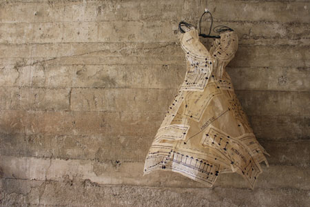
A Conversation with Judith Selby Lang, beach plastic and book artist
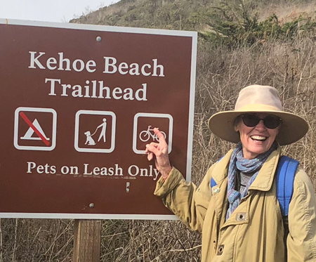
Judith Selby Lang at Kehoe Beach. Photo: Richard Lang
Judith Selby Lang’s website states that she “is an artist committed to the creation of positive symbols and life-affirming images to help energize the conversation about social, political and environmental issues.” This is a perfect description of the uplifting and transformative nature of her multi-dimensional art practice as well as a reflection of her demeanor and personality—creative, positive, life-affirming, energetic, and openly communicative about critical concerns that affect us all.
Lang’s work includes artist’s books, mixed media objects, and a wide range of projects using plastic debris collected from 1000 yards of one beach on the Northern California coast. Lang has an extensive exhibition history. She currently has a large scale beach plastic installation in The Secret Life of Earth: Alive! Awake! (And possibly really Angry!) at the American Visionary Art Museum in Baltimore, Maryland; and will be showing in The Great Wave: Contemporary Art about the Ocean at the Bedford Gallery in Walnut Creek, California in early 2020. Her current project is creating a wedding dress made from recovered plastic bags for exhibition in Castaways: Art from the Material World at The Bateman Foundation in Victoria, British Columbia, which opens in Spring of 2020.
Lang has a BA from Pitzer College and an MA in Interdisciplinary Studies in Creative Arts from San Francisco State University. She spent many years teaching art in a variety of North Bay (California) venues before turning her focus to the studio full time. With a barn full of beach plastic—washed, sorted and boxed—collected over the years, Lang has an immense body of work, both independent and collaborative, which reflects our times while engaging viewers from all walks of life in conversations regarding possibilities for improving our environment.
We visited on a bright fall afternoon in her rural Forest Knolls studio, just a short drive to Kehoe Beach.
Nanette: How did you come to art?
Judith: Defining myself as an artist was a long time in coming. I thought I would never have the patience to be an artist. People have this preconception that art is a wild and spontaneous activity but don’t know that after the flash of inspiration sometimes a long and tedious effort is required to realize the vision.
I grew up in a family that was art friendly. My dad and mom both painted. We went regularly to the art museum. In 1962 my parents took me to the Dallas Museum of Art where I saw Andrew Wyeth’s painting That Gentleman.
The painting drew many to the museum—there were long lines with stanchions and velvet ropes to control the crowds. Was it because curious onlookers wanted a glimpse of a painting of a black man? Mind you it was a simple scene of a black man seated, in dusky light, in a moment of repose. It’s of Wyeth’s neighbor Tom Clark. To me it seemed a radical move for the museum to exhibit a painting of a black man especially at a time when segregation still existed in the South. I remember water fountains with signs for whites only, for blacks only. This was 1962, years before the Voting Rights Act of 1965 and the Civil Rights Act of 1968. Perhaps it was the shock to the public that the museum had purchased the painting or maybe, it was, as I would like to think, that there was tremendous interest in seeing a masterwork by a great American artist. Either way there were people, lots of people waiting for their turn to view the painting.
The line moved slowly in a kind of reverential prayer and when it was my turn I stepped up in front of the painting to gaze with wonder not only at the power of the image but also the incredible finesse of the brush work. Something in my young heart was deeply moved. At that moment I made a commitment to art. I made my pledge to become an artist. That an image could have such an incredible impact on me and the people who had come to the museum was something that I too wanted to accomplish. On that day, at age twelve, I knew that I wanted to do something that would make a difference—to make art that would shine a light on injustice in the world.
A Conversation with printmaker and book artist Felicia Rice
Felicia Rice, well known for her fine press work and collaborative books, celebrated 40 years of Moving Parts Press in December with a solo show at Felix Kulpa Gallery in Santa Cruz, California. Rice has worked with notable Californian artists and writers including: Francisco Alarcõn, Elba Rosaria Sánchez, Juan Felipe Herrera, Enrique Chagoya and Guillermo Gómez-Peña. As Moving Parts Press, Rice has received the Rydell Visual Arts Fellowship, Elliston Book Award, Stiftung Buchkunst Schänste Bücher aus aller Welt Ehrendiplom, and grants from the NEA, CAC and the French Ministry of Culture with Perseverance furthers: Moving Parts Press 1977–2017. Rice celebrates her history as printer, publisher, artist and collaborator. We visited the gallery to experience the work, talk about making books and working with other creatives.
Whirligig: You started Moving Parts Press in 1977 as a printshop in downtown Santa Cruz. How did you come to letterpress?
Felicia: When I was a kid a friend’s mother had a letterpress in the family room. It was a little table top pilot press. I can remember standing in the room and seeing it, and maybe touching it.
My folks were artists and teachers: my mother was a sculptor and kid’s art teacher. I grew up in her art classes and was exposed to all types of fine arts. My parents were founding members of the Mendocino Art Center. My father was a mosaic artist in the Art and Architecture movement in San Francisco working with Lawrence Halprin. He did pool bottoms and walls. Later he made independent fine art animated films.
The critical point came after I had left home. I was living in Berkeley around the corner from David Lance Goines’ studio and letterpress shop. My mom accidentally sent me one of those San Francisco Chronicle Weekend Edition articles on “Letterpress Printers of the Bay Area.” Adrian Wilson, Jack Stauffacher–there were about five of them. She accidentally sent it to me instead of my older sister. So I’m reading this thing and looking in the window at what’s going on around the corner. I started thinking this might be something I could get into. It didn’t necessarily mean I had to stay with it. I was 18 or 19 and thought maybe I could learn more. I went to Laney College which had a print and graphics program. The instructor said, “If you want to be a printer you need to get into computers.”
It was a time when there was a lot of support for crafts. A lot of my peers who grew up in California were carpenters or in the trades, which were highly respected. And the newspapers listed a lot of jobs for printers; so I thought I could be a printer. I could get work. At Laney there was some old letterpress stuff, but there was mostly this idea that one would go on to computers. It was interesting. I had also taken a printmaking class in Oregon around this time. I thought I could go to school for this but if it was just a fluke I could change my mind and do something else. I started looking around for print programs. There wasn’t really anything going on in the Bay Area. I came down to Santa Cruz with a friend to visit the school, and a friend of my friend said there was a press in the basement of Cowell College dining hall. So we went down there and there was this beautiful letterpress studio with a Vandercook, type and floor to ceiling windows with a gorgeous view of the bay. That’s how I got started. Jack Stauffacher was teaching.
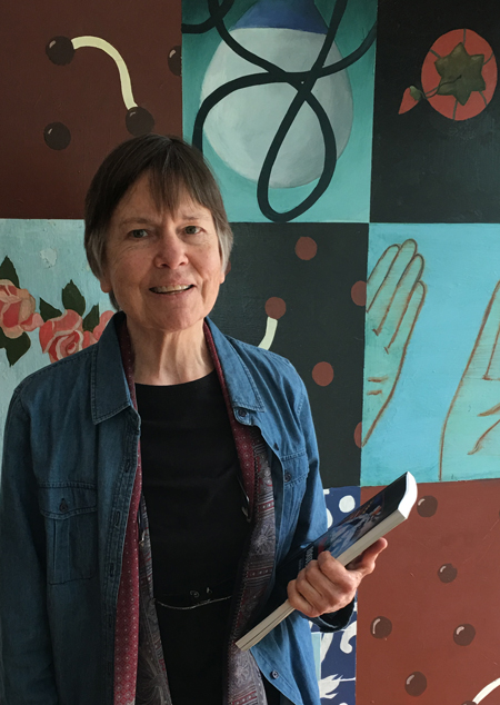
Felicia with some of her books. Photo: Kent Manske
A Conversation with artist, educator, writer, curator Jan Rindfleisch
Jan Rindfleisch in front of a painting by José Arenas
Jan Rindfleisch is an artist, educator, writer, curator, and cultural worker. She was the executive director of the Euphrat Museum at De Anza College in Cupertino for 32 years. During that time, Rindfleisch laid the groundwork for an engaged and inclusive museum environment by continuously tapping the diverse local voices of Silicon Valley. Rindfleisch continues her work as a community builder with Roots and Offshoots: Silicon Valley’s Arts Community, a history of the art of the greater South Bay area from the post-Mission era artifacts of the Ohlone peoples to the artists and activists that have made the western/southern half of the Bay Area the rich and vibrant scene it is today.
Rindfleisch has a BA in Physics from Purdue University and an MFA from San José State University. Her awards include: Silicon Valley Business Journal Women of Influence (2014); San José City Hall Exhibits Committee (2006–2013); The ABBY Awards (2010); Silicon Valley Arts & Business Awards; Arts Leadership Award; Santa Clara County Woman of Achievement, (1989); Leadership Vision Award in the Arts, Sunnyvale Chamber of Commerce (1993); Civic Service Award, City of Cupertino, Cultural Arts, and the Asian Heritage Council Arts Award (1988).
Nanette: What was the impetus for you to write this book?
Roots and Offshoots book cover image
Jan: I am one of those people that love to question boundaries. I started thinking: How did we get past the exclusion in the art world in the monochromatic 1970s, which didn’t reflect the breakthroughs of the 1960s, such as women’s rights and civil rights? How did we take that early cultural landscape, break new ground, and build new forms for the future? After decades as an arts museum director and a lifetime career as an artist, author, community advocate, and educator with an earlier background in the sciences, I decided to put some of the explorations and findings together.
My book and project Roots and Offshoots: Silicon Valley’s Arts Community begins with an essay entitled The Blossoming of Silicon Valley’s Arts Community and a profile of artist/activist Ruth Tunstall Grant. A Spiral Through Time follows threads between the ancestral Muwekma Ohlone, Juana Briones in the 1800s, Marjorie Eaton and her arts colony in the 1900s, and artist Consuelo Jimenez Underwood today. Over a period of years of research and writing, the book grew to about twenty profiles and two additional guest essays; one by Maribel Alvarez about MACLA, “Doing that Latino Art Thing,” and the other by Raj Jayadev about Silicon Valley De-Bug, “The Anatomy of an ‘Un-Organization’.”
There are people in Silicon Valley connected with incredible history, but their story isn’t being told. Their experiences tell a different story of who we are. Origins of organizations are often forgotten or rewritten, and the originators erased. How can one or a few names stand for an organization/period/idea and the rest be forgotten? How does this erasure affect our view of ourselves as creators and as being worthy of judging or promoting art, or taking a larger role in our community? I wanted to add some of these missing pieces that contribute to a richer story of Silicon Valley’s art scene. Frustration with systems can be a motivating force. Another big personal motivation was gratitude. This book is a way to thank so many people who paved the way and with whom I worked.
Nanette: The Bay Area is deeply rich in terms of cultural diversity and creative output. How did you determine which groups to represent, likely knowing that you could not include them all? Who was left out? Will there be a second volume?
Jan: The book is not a survey of the South Bay Area scene. I wanted to tell the story of the trailblazers who truly made a difference in Silicon Valley, and to provide broader historical context for their experience. A major/shared motivator was to share with the reader how the artists/activists in this book enrich us personally. The artists/activists open us to the art of daily life, and to the artist within each of us. They get us to examine ourselves, to question our lives, and to think freely. They inspire us to dream and imagine and effectuate change—to build connections (not walls!) and enliven our communities.
A Conversation with book artist and papermaker Michelle Wilson
Michelle Wilson is a papermaker in an extremely complex sense. Her work with paper is both conceptual and concrete as it extends from the making of sheets for artist’s books and printmaking to social practice, sculpture and installation. As a somewhat recent transplant to the Bay Area, Wilson has quickly embedded herself and her work into the consciousness of the local art scene with a residency at the School of Visual Philosophy, a Small Plates commission from San Francisco Center for the Book, teaching at both San José State and Stanford, engagement with a handful of arts organizations, and many exhibitions.
This summer, Wilson’s collaboration with Anne Beck, The Rhinoceros Project, travels to the Salina Art Center (Salina, Kansas), Shotwell Paper Mill (San Francisco, California), the Healdsburg Center for the Arts (Healdsburg, California), and later this fall to the Janet Turner Print Museum in Chico, California. Her work is included in The Power of the Page: Artist Books as Agents for Change at the New Museum of Los Gatos (NUMU in Los Gatos, California), and Pulp as Portal, Socially Engaged Hand Papermaking at the Salina Art Center in Salina, KS. Wilson has a BFA from Moore College of Art and Design, and an MFA from the University of the Arts, both in Philadelphia.
We got together on a lovely spring afternoon towards the end of the semester to talk about art and teaching.
El Proceso at NUMU by Michelle Wilson. Photo: Robert Wuilfe
Nanette: I first became acquainted with your work in 2010 at an SGCI Conference in Philadelphia, occurring at the same time as Philagrafika, where I came upon a Book Bomb intervention in a public park. How did this collaboration with Mary Tasillo come about?
Michelle: Book Bombs began as a question I posed on Facebook. I was reading about yarn bombing, the tradition of knitting or crocheting something that is then bombed— left in a public space—a form of craft meets street art. I’m not a knitter or a crocheter; I’m a book artist, and so I posted a status update, “What would it mean to book bomb?” Mary took me seriously, and through our conversation, we discussed where people read in public space, who owns public space, and it led us to the idea of park benches. In Philly, every park bench has this center bar installed that is called the “arm rest,” but is designed to prevent a homeless person from sleeping comfortably on a bench. This seemed like an ideal place to install a book. Our project grew from this initial idea. And thus, Book Bombs was born.
Book Bombs by Michelle Wilson
Nanette: What were you envisioning regarding the scope and effects of Book Bombs?
Michelle: We originally saw Book Bombs as just a project for Philagrafika 2010. However, we’ve had so much fun, we’ve continued. It’s been tricky to keep it up transcontinentally, but we manage. Most recently, we did a sort of intervention-workshop at the Center for Book Arts in New York called Keeping the Fire Alive. This was designed as a workshop for activists who were interested in using papermaking in their work, as well using it as a form of self-care against fatigue and for continued resistance. We’d originally proposed the workshop during the summer of 2016, before the election, thinking it would be a very different conversation.
A Conversation with conceptual artist C.K. Itamura
C.K.Itamura with Walk (2016) and 2016 thru 2064 (2016): Michelle Feileacan Photography
C.K. Itamura is an interdisciplinary artist, designer and producer. Her work responds to a wide range of personal and social content; and is realized as richly engaging, metaphorically layered, participatory, conceptual installations. C.K. is Director of Marketing and Events for San Francisco Center for the Book and a board member for Healdsburg Center for the Arts.
Her most recent work s+oryprobl=m is a three part series of exhibitions which may be experienced at: O’Hanlon Center for the Arts, Loft Gallery in Mill Valley (June– July 2017); The Spinster Sisters in Santa Rosa (April–June 2017), and City Hall Council Chambers also in Santa Rosa (thru May 4, 2017).
We chatted over an early evening cup of tea in mid April.
Nanette: You are making and exhibiting complex, multi-layered, series of works that are highly metaphorical and cross media distinctions. How would you advise new art audiences to approach and experience your work? What do you hope people will “get” from experiencing your art?
C.K.: I’ll use my piece Ladies (2015) to illustrate your point.
Ladies was inspired by a surreal hours-long conversation I had one afternoon in 2013, with two strangers in an art gallery. One woman was a retired physician with crutches, the other woman was an art patron that I’ve seen at artist receptions but had never spoken with before. Over the course of the afternoon, the retired physician revealed that she wanted to die because her crippled legs prevent her from doing all the things that hold joy for her, such as hiking, swimming and traveling. The art patron revealed that she had lost all of her money and was now living in a van that she had to park in a different place every night to prevent getting into trouble with the police. After the conversation concluded when the gallery closed for the day, I wrote down notes that would remind me of this curious encounter. Two years later, the notes evolved into Ladies, a wall mounted sculpture in the style of a mini-dress that Tina Turner wore on stage during a performance with Mick Jagger on the British stage of the Live Aid Concert in 1985.
Ladies is constructed of torn paper grocery bags; it is a bag dress that suggests the phrase “bag ladies,” term recalled from childhood that was used to describe seemingly homeless women who kept all their belonging in bags they carried with them, from place-to-place, at all times. Ladies is symbolic of contrasts: the facades of the retired physician and the art patron vs. a hidden desire to die and destitution; the opulence of Tina Turner’s memorable performance during a come back era of her career vs. the desperation of forgotten “bag ladies.” Excerpts from the notes I wrote after the curious conversation were written on the paper bag sections in pencil then selected words were traced over in permanent marker. In a final nod to another lady, my maternal grandmother, who hung laundry outside, rain or shine, the inside of the piece is filled with wooden clothes pins that are not plainly visible from the outside, as my grandmother was rarely seen away from her home.
A Conversation with Angelica Muro, integrated artist, curator, cultural critic, and art educator
Angelica Muro is an integrated artist, curator, and art educator with a strong interest in cultural criticism. Originally from the Central Valley agricultural community of Hopeton, California, Muro grew up on an apple orchard. As a child she became interested in photography, media imagery and popular culture. Muro served as Gallery Coordinator for WORKS/San José for five years, and as Educational Programmer for Movimiento de Arte y Cultura Latino Americana (MACLA, San José, California) for three years. She has a B.A. in photography from San José State University, and an MFA from Mills College in Oakland, California. She is currently Director and Chair of Visual and Public Art at California State University, Monterey where she teaches courses in photography, integrated media and media culture.
Her newest project, created with Juan Luna-Avin, Club Lido: Wild Eyes & Occasional Dreams opened February 12 at Empire Seven Studios in San José. We chatted over tea in early January, at Angelica’s Japantown (San José) bungalow. Reina Sofía, Angelica’s eight-year-old rescue pup, sat on her lap.
Nanette: How did you come to be an artist?
Angelica: I’ve been interested in art since I was a child, but I was never really good at making—I suppose my vision never matched my actual skill set, it still doesn’t. I remember always trying to make things such as sculptures and drawings, but never having the dexterity. Photography came into my life very early—my fourth grade teacher, Mrs. Dixon, had a pile of National Geographic magazines I was pointed to whenever I finished my assignment early—this was the first time I was truly able to look at images, photographs, people. Since then, it’s become my primary area of interest, socially and culturally.
Nanette: The first time you were able to look at images or that you became aware of the power of images?
Angelica: Aware of the power, of ways of seeing, of actually looking. We are so visually saturated, so much so that we are not actually seeing. I read recently that the brain is on a need-to-know basis. Our brains store the information in our environment and we don’t actually see it, even as we know it is there.
I very vividly remember looking through these National Geographics and seeing, seeing things that I had never seen before. It was new information. This is why travel is so exciting, it’s overwhelming new information for us that we are absorbing in a completely different way, and we take that absorption as being creative influences.
Nanette: Much of your work exploits and reveals the tensions between consumer celebrity culture and the realities of working class and immigrant lives in contemporary America, perhaps even specifically California. Who do you see as your audience for this work and what do you hope it achieves?
Angelica: I don’t often think about audience in the traditional sense; although as an educator, I often address ethical concerns involving audience with my students. I happen to live and work in California, so my work deals with the complexities of this eco-system—the spectrum of productivity, exploitation, and the distribution of wealth—and often explores issues of gender, race, and class. I’m interested in social issues, and I find that visual tension inspires me to create.
I think there’s several ways to think about audience—I remember being in graduate school, a time that allowed me to experiment with ideas with a critical, yet limited audience. Suddenly, I had a body of work about being Latina, being a woman, being the daughter of a farmworker, and navigating social constructs. And then my audience became people who where interested in issues of identity. However, my work deals with larger social issues of equalization, socialization, conditioning, and the various codes of gender identification. It’s a dialogue with my community, my artist cohort, scholars, thinkers, curators, and activists who are interested in issues of positionality and privilege. I suppose that in the simplest and most complicated sense, my audience is one interested in issues of difference, otherness, and diasporic culture. I question ideological frameworks of meritocracy, social mobility, and distribution of wealth, because I want to, in small part, be in dialogue with someone, anyone, interested in discourse about the complicated social structure we live in.
Agricultural Workers series (Cali-for-nia), pigment print, by Angelica Muro, 2012
A Conversation with MicroClimate Collective, Glenna Cole Allee and Victoria Mara Heilweil, artists and curators
Glenna Cole Allee (right) and Victoria Mara Heilweil (left) make up the collaborative curatorial project known as MicroClimate Collective. The exhibitions they produce are thematic (Hypnagogia, Wabi Sabi, Night Light, Chance Operations, Unseen Unsaid, Everything Must Go!, Eidolon, Perfect Place/No Place, X Libris, A.D.D.) with strong considerations for the nuances of layered meanings within the language of the title, and appear to seek unexpected, if not surprising, interpretations across creative genres.
MicroClimate has a focus of interdisciplinary visual and performing arts programming which provides a context for cross-pollination between diverse circles of Bay Area artists. Their mission is to foster experimentation, collaboration, and risk-taking in an atmosphere free of commercial pressures.
Within this entity they have curated eleven multi-disciplinary exhibitions during the last seven years. They are currently preparing their twelfth, Obsidere which opens at Alter Space Gallery (San Francisco) on May 9.
Glenna and Victoria are both exhibiting visual artists, often working with photography. We chatted in late January in Victoria’s Mission District flat.
Nanette: Individually, how did you come to be an artist?
Victoria: I started off doing film and video work while I was in high school and majored in that in college. While in college I also took quite a few photography classes, which is where I discovered that I loved all media that utilized a frame. I made an experimental film in college, and also did some less than traditional photography. I think I knew then that I wanted to be an artist, but feared that I wouldn’t be able to support myself and so didn’t immediately call myself that, or move in that direction. Out of college I worked first in the feature film industry in editing, and then in the commercial photo industry as a photo assistant and studio manager. While working I was still doing my own personal photography work, and it became apparent that I wasn’t cut out to be a commercial photographer. At that point I committed to getting my MFA and being an artist. I would say that it’s only been the last ten years that I have been really actively showing my work and moving my art career forward.
Glenna: I certainly tried not to. This fact of who we are, as artists, seems to be a wider circle that persistently swallows whatever other circles we draw. I tried to do other things and deny it but it wouldn’t leave, this predicament, “artist.” I have become better at putting parentheses around the resistance and the doubt. Recently I’ve been inhabiting a certain excitement and deep joy in working consistently, as well as a daily sense of appreciation for being able to make, and give time to, my work.
Nanette: How did you come to be MicroClimate Collective and how do you think of yourselves inside of this entity?
Victoria: I had a friend who was the Artistic Director for the Climate Theater on 9th and Folsom Street. It was a small theater that had been around a while, but when she took it over she had a vision of it having other programming than just theater. She invited me in to check out a space she thought could work for visual art and asked me to tell her what could be done there. I gave her some suggestions and then she asked if I would run it. I had been doing some curating as part of my teaching at City College of San Francisco, but was definitely interested in doing more curating outside of that arena so I said yes. Very quickly I realized I needed help with this and invited Glenna and another artist to join me.
Dee Dee Kramer spoken word performance in Biblio Babel by Glenna Cole Allee and Yulia Pinksuvich from X Libris. Photo: Victoria Mara Heilweil
I knew Glenna from showing her work in the student gallery at City College. There was also a music series and a film series at the theater. The three of us joined forces with the three film series curators to put on one night shows that took over the whole floor. We showed all different media including music, performance and spoken word. It was exciting, but very tiring and eventually the other curators left to go on to other pursuits leaving just Glenna and I. We had decided after a few years that we wanted to start looking for other spaces to curate our thematic shows, and to have them last more than one night. Right about that time the Climate Theater lost their lease and closed, which forced us to move on.
I think of myself as one of the co-founders and primary co-curators of MicroClimate Collective. Glenna and I each have different strengths and wear different hats, although we can switch off if needed.
Glenna: I was just finished with an MFA and there was Victoria, beckoning. The MFA experience I’d just finished had been transformative–the constant company and critique of others who understood art as the main focus, having everything needed right there. I wanted to actively sustain dialogue and community, and this curatorial project seemed like a possible way. It was very interesting, to create a project together to try to foster creative community–the multi-genre shows might become a conversation between artists. That was one main motivation that drew me–the notion that MicroClimate might initiate work, and even collaboration between artists. It’s been a very satisfying thing, that we have inspired others in this way a little bit.
How I think of myself within MicroClimate: as an artist, with all my personal aesthetics and sensibilities, working intentionally to be a creative collaborator. Which entails seeking to meet halfway, and to be receptive/inviting to the third thing in the room, to what would not be created alone.
I often am in the role of filtering our ideas into language, of pushing to articulate our themes, and sometimes raveling them into little knots and back out again. I find this interesting; actually enjoy it.
A Conversation with poet and Al-Mutanabbi Street project initiator, Beau Beausoleil
Beau Beausoleil is a San Francisco-based poet and the proprietor of the Great Overland Book Company, which is located in San Francisco’s Inner Sunset neighborhood. Beausoleil has written more than ten books of poetry. His most recent collection, Ways to Reach the Open Boat, was published by Barley Books, UK in 2013.
In 2007 Beausoleil read an article in The New York Times about a car bombing on al-Mutanabbi Street, the historic bookseller’s street in Bagdad. This incident inspired the creation of the al-Mutanabbi Street Coalition, a project which currently has five distinct components: 130 letterpress printed broadsides; 260 artists’ books; a publication of poetry and prose titled Al-Mutanabbi Street Starts Here; the coordination of poetry readings around the world each year on the March 5th anniversary of the bombing; and most recently Absence and Presence, a call to 260 printmakers for the creation of fine art prints.
The project involves hundreds of artists who have created work specifically as a response to the 2007 bombing; and extensive local and international exhibition schedules, much of which Beausoleil coordinates himself. Complete editions of the visual art responses will ultimately be donated to the Iraqi National Library in Bagdad.
We met in early February over a cup of tea at Beau’s kitchen table.
Nanette: What is poetry?
Beau: What is poetry? At one point in my life I stood on the corner of Powell and Geary, it was real close to Union Square not that far from Macy’s, and I had a little box next to me on the ground that had a sign that read “Support your local poet.” I would give out multiple copies of a poem that I had printed out to anyone who would take them. They didn’t know that they were poetry. My secret hope was that some patron would appear out of nowhere with a wallet, but of course that never happened.
I usually made enough to print out the next batch of poems. Some people would avoid me. They would go out into the street thinking that I was handing out a religious tract or a political tract of one kind or another. Some people would take them. I’d see them read them. I’d see them crumple them up after half a block and throw them away. But every now and then something would happen. I remember this one guy who took a poem. I watched him walk down Powell and I could see that he was reading the poem. He got about three quarters down the block. He turned around and walked back to me and said in this agitated voice, “I don’t know what this means, but this one line, that speaks to my life.” That’s poetry.
One time I was part of a group that was visiting Folsom Prison where there was a writer’s workshop. The visitors would read and then the prisoners would read. During the break this guy came up to me and said, “Are you Beau Beausoleil?” And I said, “Yes.” He said, “Did you have a poem in . . .” and he named this small magazine, and I said, “Yes.” He said. “Did it go like this. . .” and he recited my poem back to me. I was pretty stunned. He said, “I just wanted to tell you that that is the poem that started me writing.” That’s poetry.
Lorca, the Spanish poet, tells a story about duende. Duende is the inexpressible in art, in beauty. It’s there and you can feel it. Some people can recognize it. It’s an important part of the life of any artist who is really at that point. He tells a story to illustrate it.
There was a flamenco contest in this basement in Spain. All these young women are assembled. They are all in their 20s and beautiful. They are getting ready to go on the stage to perform before these three judges. Suddenly the door opens. A woman in her late 50s walks in, walks straight up to the stage, throws her arms in the air and the judges declare the contest over because they could see that she had duende. That’s poetry.
Poetry is something that gives you back part of your own life. It allows you to see your own life in another form, another way. That’s what poetry is.
A Conversation with Paul Davies, composer, music educator, and concert pianist
Composer, music educator, and concert pianist Paul Davies recently completed his first full length opera based on the life of Charlotte of Belgium who was Empress Carlota of Mexico during the period in Mexican history known as the French Intervention.
Davies received a Ph.D in music from the University of California at San Diego. He currently teaches composition, music appreciation, music theory, and a course on the Beatles at Foothill College in Los Altos Hills, California. Davies has also appeared as soloist with the Foothill Wind Ensemble, the Winchester Orchestra, and the South Valley Symphony.
Paul Davies at the piano
Whirligig: You recently completed the writing of an opera, Carlota. What inspired you to write an opera?
Paul: I had been invited to give a talk about my music and present a new composition, an instrumental ensemble piece, at the Ernest Bloch New Music Festival in Newport, Oregon, in July of 1999. I was at one of the festival concerts where another composer premiered a new chamber opera of his when the idea of doing an opera myself flew into my head. I had been thinking of the tragedy of Empress Carlota for quite a few years before this, but never with the idea of doing an opera on the subject.
I suppose another impetus was that I’ve always been fascinated by history and of the possibility of traveling back in time. So doing an opera on Carlota is the closest I’ll ever get to time-travel, so to speak. I realized that my research would involve reading every major book on the subject I could get my hands on and also traveling to Mexico City to visit Chapultepec Castle, where Carlota and the Emperor Maximilian lived during their short reign. I very much looked forward to this.
Whirligig: What path did your research for this project take you on?
Paul: Since I was intent on doing the text myself, I spent a lot of time researching how to do a good libretto, and I also consulted with two dramaturges who gave me much invaluable advice. I analyzed quite a few librettos to gain further insight. Also, I came across very interesting photographs of the time period. I remember being at the library of San Diego State University and finding a photograph of the moment Maximilian and Carlota enter Mexico City in June of 1864.
Every time I read about an historical event, there’s always at the back of my mind this very small sense of myth, a sense of maybe what I’m reading about didn’t happen since I wasn’t there to actually see it. It’s not that I don’t believe the event happened, or that the historical figure in question never existed, It’s just that tiny feeling of “unreality” since I didn’t experience it myself. But when I saw this photograph I almost jumped and said to myself, “Wow, this really did happen.” I get the same kind of feeling when I look at a life mask of Beethoven, or some other figure for whom the only visual representations are idealized paintings. If I hadn’t been a composer, I probably would have been an historian.
A Conversation with photographer and book artist Diane Cassidy
After Manet’s dejeuner sur L’herbe by Diane Cassidy.
Bay Area photographer and artist Diane Cassidy celebrates her 82nd birthday this month with the showing of a new series of photographs at the annual San Francisco Altered Barbie show, and the launch of her first website. Cassidy studied photography at San Jose State University in the late 1980’s, and continues to take classes with respected photographers through various peninsula venues. A monograph of Cassidy’s work is scheduled for publication by Hunger Button Books in 2013.
Nanette: How did you come to be an artist?
Diane: For me, becoming an artist was an indulgence. Throughout my formative years I was equally interested in making art and natural science. An unfortunate marriage ending in divorce left me, at a very early age, completely responsible for myself and my two children.
My first plan in preparing myself for a well-paying job was to get a degree in Art Education. Being young and impatient, I just couldn’t tolerate the necessary Mickey Mouse curricula; those how to educate courses were so so boring. I had trouble staying awake. One day while conversing with fellow classmates I learned that with a degree in a related science I could qualify for an internship in Medical Technology. I made the switch. How I relished those difficult chemistry and physics classes. A welcome relief.
During my 20 year stint as a Medical Technologist I was always taking art classes and workshops. Art was my hobby. Then one day in the 70’s while on vacation I stopped at the Script’s Institute. I noticed some images of shore life displayed on their walls that I really liked. Upon asking I learned that they were hi-contrast photographs. Thus began my foray into photography.
One day I attended a photo workshop in portraiture with Margo Davis at the Palo Alto Cultural Center. While she went over her bio she mentioned that though she had a BA in French from San Jose State, she returned to get a MA in photography. I had gotten a BA in Biology from San Jose State years ago; maybe I could return to get a MA in photography. Which I did. I retired as early as I could from Valley Medical Center and concentrated on photography in earnest.
A Conversation with visual artist, Lisa Hochstein by Kent Manske
Wrap 2 by Lisa Hochstein
Lisa Hochstein is a Santa Cruz, California-based artist who works in collage, painting and fiber arts.
She recently curated the exhibition Earth • Science • Art for the R. Blitzer Gallery in Santa Cruz. The exhibition paired 16 scientists from the USGS Pacific Coastal & Marine Science Center with 16 Bay Area and Santa Cruz artists.
Hochstein has a BFA in painting from the University of Massachusetts, Amherst.
Whirligig: What is art?
Lisa: My answer to that depends on whether I am in the role of artist or of audience. As someone who creates objects, art making is a response I have to the world’s bumping up against my awareness. Making art feels very instinctual though I can’t completely explain why I feel drawn to this particular activity. It has always seemed a little strange to me—that awareness leads to a desire to make something. When I am in my studio, my frame of mind is one of openness and curiosity and a certain amount of discontent or unease. Each piece grows from a combination of feelings, ideas, memories, associations and formal considerations, plus elements of chance and luck that I always hope to be awake to. I regain some kind of equilibrium through my work, but it’s not just about that. I also want to be surprised by what I’m doing.
Origins by Lisa Hochstein
When I’m in the role of audience, I take in someone else’s work and want it to transfer some of that initial response/art-making impulse from its maker to me. As a viewer I also look for something I recognize as much as I look to be surprised. Elegance, honesty, technical skill, originality, narrative truth and aesthetic truth are some of the touchstones for deciding whether I regard something as art or creative output, which strike me as different from each other. There is a lot of creative work that may be artistic but not what I would call art. For me, something that is awkward and raw can be art while something beautiful and harmonious can easily fall into a creative-but-not-art category. Art needs to sing.
Bay Area artist Valerie Raps recently completed a public art commission for the Alum Rock History Corridor Project.
Cultivating Community is a life-size, stylized spring tooth harrow created from fabricated steel and cast bronze. The tines of the harrow are made from casting the arms of ten San Jose community members. The sculpture is located at Tropicana Shopping Center in East San Jose.
Raps has a MFA from San Jose State University and a MA in Holistic Counseling from JFK University. She is also the Resident Curator of Art Ark Gallery in San Jose.
Nanette: You recently completed a commission for a sculpture for the Tropicana Shopping Center. Tell us about this project.
Valerie: The project was commissioned by the City of San Jose Office of Cultural Affairs in collaboration with Don Imwalle, who is the property owner of the northeast corner of Tropicana Shopping Center on King and Story Roads in San Jose.
About three years ago the city put out a call for participation for submissions to be part of an artists catalogue. They selected 30 out of 300 applicants for this catalogue which was then made available to developers who build commercial and residential spaces. I was one of three artists to present proposals for a public art project for the Tropicana Shopping Center. The site is part of a larger project called the Alum Rock Cultural History Corridor, an area in East San Jose which has pinpointed several locations for public funds to commenorate the rich and diverse history of the area.
A Conversation with singer songwriter Steven Andrew Kacsmar of Phantom City
Steven Andrew Kacsmar
Steven Andrew Kacsmar is a San Francisco based singer songwriter. His band, Phantom City has just released its second CD Off the Map.
Nanette: Off the Map is Phantom City’s second CD and your third. What goes into making an album and how do you determine the arc of the music?
Steven: My songs come from my experiences and sometimes from my idealism. Sometimes I write tunes to try and help people think about how things could be better. Sometimes I just have a story to tell. But even the songs that are about a real event often undergo a transformation from the literal to the allegorical.
In terms of making a CD, there is a lot of work that goes into producing a CD that goes unnoticed unless you don’t do it. For example, on Off the Map we recorded many takes of each part then picked the best sections and then blended them into a single track. We also ironed out any wrinkles so that we put out a polished product, hopefully without losing the fresh feel of the song. In the process of creating a CD, you spend a lot of time listening, and honing, taking out as much as you put in.
Nanette: How did you come to be a musician and songwriter?
Steven: I’ve always been musically inclined; I sang on my mom’s lap in the car when I was a child. I was in band in high school and have been playing guitar since I was about 8. There’s always a soundtrack going on in my head. I was curious so I asked some of my friends if this was true for them and was surprised to learn that not everybody has a soundtrack to their life going on in their head. So I guess it’s safe to say that music is an integral part of who I am as a human being. I have worked at many things in my life, but the day gig I had longest was with Bank of America, for 21 years. When I left the corporate world behind, it was with a very clear intent to focus on my music while I still had some fire in my belly.
A Conversation with textile and book artist Jody Alexander
The artist in her studio
Santa Cruz based artist Jody Alexander is known for creating complex characters whose narratives are revealed through an array of artifacts which almost always include handmade books and are often exhibited as interactive art installations.
Her work celebrates collecting, storytelling, and odd characters.
Alexander has just completed two solo exhibitions: Jody Alexander: Sedimentals at Mohr Gallery in Mountain View, California; and The Odd Volumes of Ruby B.: An Installation at Saffron and Genevieve in Santa Cruz, California.
In the first half of 2011 Alexander’s work was included in: The Art of the Book at Donna Seager Gallery in San Rafael, California; The Book: A Contemporary View at Delaware Center for the Contemporary Arts; Reconstructions at Conrad Wilde Gallery in Tucson, Arizona; Encaustic with a Textile Sensibility at Kimball Art Center in Park City, Utah; and Masters: Book Art published by Lark Books.
Alexander has a BA in Art History from UCLA and a MS in Library Science from Simmons College in Boston.
Nanette: How did you come to be interested in the book as an art object?
Jody: While working on my Master’s degree in Library Science in Boston, Massachusetts. One of my professors took our class to Harvard’s Houghton Library. He began by showing us medieval manuscripts: Book of Hours, Gutenburg Bible, Nuremburg Chronicles amongst others. Obviously, this was very exciting to examine these treasures up close, but then he started taking out artists’ books. I don’t think I had ever seen an artists’ book before, and if I had, I wasn’t really aware of them as a genre of art. I think that I couldn’t breathe for a little while. I had one of those moments when everything suddenly made sense and it was clear that this is what I wanted to do. I proceeded to do every remaining project in Library School on artists’ books: their history, collecting them, storage and preservation of artists’ books, etc. As soon as I graduated I started to make them.
Nanette: Tell us about the first book you made.
Jody: When I was about eight or nine I know I made some small books. I used to draw a hillbilly family and type out their story on my green portable Sears typewriter. These eventually became little books. I’m not sure how I bound them. They were just little pamphlet books. They no longer exist.
Photographer Marion Patterson has several new bodies of work coming out based on recent travels to Antarctica and the Galapagos. Patterson was mentored by Ansel Adams who became a lifelong friend. She also studied with Dorthea Lange, Pirkle Jones, Jerry Uelsmann, and Minor White. She studied philosophy at Stanford and received her Masters in Interdisciplinary Creative Arts from San Francisco State University. Patterson was faculty at DeAnza and Foothill College for 28 years. She currently makes her home in Anchor Bay, California.
Nanette: How did you come to paint on your photographs.
Marion: I was a painter first. A watercolor painter. But from an early age it was always photography, and then I fell into the Ansel Adams circle.
When did I start painting again? Maybe when I saw Holly Roberts’ work. She paints thickly and saves only little bits of the photograph. Instead of that approach I wanted part of the photograph to be painted on. I love paint. When I got my Masters at San Francisco State I took a course in animation in which I had to draw on cels. It’s an incredibly complicated thing. I made a camel walking across the screen and all this stuff. It was two or three minutes of film. My instructor said, “Did it come out the way you wanted it to?” and I said, “Yes, and that’s the problem.” It didn’t give me any surprises. The thing with paint is that there is always a surprise. Even with drawing there is a little surprise depending on how you hold the pencil. That’s what I love about paint. It leads you. The camera leads you. The darkroom leads you.
Nanette: When you are isolating a particular element in an image what are you thinking about?
Antarctica Warming by Marion Patterson
Marion: It is a matter of how do we see? How do we perceive as we do? Why do we perceive what we do?
Stacy Speyer recently completed a residency at the Exploratorium in San Francisco. For the Exploratorium’s traveling exhibitionGeometry Playground, Speyer created an interactive exhibit of metal geometric forms known as polyhedra. Subsequently she began work on a book on this subject called Understanding Polyhedra. Speyer was trained as a textile artist (MFA California College of the Arts) and is known for her large scale open weave installations. She is the Studio Manager of the Textiles Department at California College of the Arts in Oakland.
As Above So Below by Stacy Speyer
Nanette: What is the connection between your work in textiles and polyhedra?
Stacy: There is an underlying grid in the make up of all fabric woven on a loom, but the different weave structures possible on a loom can create a huge variety of patterns and kinds of fabrics. My favorite weave structure is called plain weave and it is the one I usually use for my loom woven artwork. It is the simplest structure and when done in the light open way I weave, the woven grid is revealed. Though it is visually layered by the colourful composition dyed into the threads. It depends on the viewer’s interest whether they are caught more by the details of colour or the organic woven. The start of all this polyhedra making, was a curiosity with a basketry technique, a hexagonal weave structure. It has three elements instead of the two in a basic grid that I am used to on the loom.
Natural fiber polyedra by Stacy Speyer
I liked the odd number of basic elements, one horizontal and two diagonals, that come together to make this regular structure. When all three elements meet, they make a small equilateral triangle and a set of two in three directions form the sides of a hexagon.
One year I worked out how to make the structure flat and the next year I tried making it into a basket. Then I wondered if I could close it off, making all the ends meet in some kind of spherical shape.
Spheres have always been a big part of my work but usually just seen as circles of dyed colour in the cloth or when the form the fabric is hung in an arc and column.
A conversation with conceptual photographer Julia Bradshaw
Photographer and video performance artist Julia Bradshaw is exhibiting seven different series of work in her first one person show at Fresno City College this month. Her work often comments on language and the mixed messages of cross-cultural exchanges.
Bradshaw was born in Manchester, England. She spent nine years working and living in Munich, Germany where she studied with Michael Jochum before coming to California in 1995. She received her MFA from San José State University in 2007. Bradshaw is Assistant Professor of Photography at California State University, Fresno.
Nanette: At Fresno City College you are exhibiting seven different series of photo-based works: Cut Pieces (2010), Case X (2010), Nocturnal (2010), On Photographing Breasts (2009), Tissue Blowing Project (2007), Constraints (2003), and Companions of my Imagination (1994). What is the thread between these bodies of work?
Julia: I am interested in the photographic series as a means to problem solve or comment on everyday life. Apart from the Nocturnal series, all of these projects have something to do with our culture and society. Cut Pieces, On Photographing Breasts and Case X are all linked in that they have to do with my investigations into libraries and books. They consider book content, the public’s misuse of books and a library’s policy on “protecting” books. The Constraints Series has to do with the various societal dictums that potentially have something inherently good and bad associated with them. For example, I have an image and text combination I call “polite conversation.” In this image I am trying to say that “polite conversation” is positive in that it ensures a civil society, however it also has a negative aspect in that polite conversation also can prevent people engaging at a deeper level. Likewise in the Tissue Blowing Project I am also thinking about language. In this project I visually represent miscommunication, disputes, failed advances, diametric viewpoints and avoidance and absence in relationships.
A Conversation with Carolee Gilligan Wheeler & Jennie Hinchcliff of Pod Post
Pod Post Photobooth
Pod Post, the mail art duo comprised of artists Carolee Gilligan Wheeler and Jennie Hinchcliff, has become an icon at Bay Area print, book, and zine fairs. Their presence is memorable in part due to their complete-with-merit-badge uniforms, their much sought after collectible mail art ephemera, and their passion and advocacy for all things postal.
In late 2009 their book, Good Mail Day: A Primer for Making Eye-Popping Postal Art, was published. It quickly sold out and has gone into multiple printings. Good Mail Day—a resource rich in visual, historical, conceptual, practical and hands-on information—was created by two inquisitively whimsical pods who know how to correspond.
Nanette: What is Pod Post?
Carolee: Pod Post—the name—started out as a brainstorm when Jennie and I were on the airplane to Tokyo in 2005. We like alliteration, and we had been playing around with the concept of a pod as a carrier of potential. After that, we discovered that one of the early national mail delivery services was called Post Office Department.
Pod Post originated as an umbrella for our postal and correspondence obsession, and we started making things under that name, rather than our individual “press” names (Jennie’s was Bubble and Squeek at the time, and mine was superdilettante), to denote that it was a partnership separate from our individual work.
Jennie: Carolee summed up the idea of Pod Post nicely—the entity came about organically, based on our mutual love of all things postal and correspondence related. Once we started appearing together at book fairs and expos as “the Pods,” we quickly realized that there were plenty of other folks out there who were just like us: people who agonized over the perfect fountain pen, searched eBay for exotic airmail envelopes, and knew their postal carrier by first name.
Bay area painter José Arenas recently completed a mural commission in his hometown neighborhood of downtown San Jose, now the up and coming art district of the United States’ 10th largest city. Arenas is art faculty at Foothill College in Los Altos Hills, California; a graduate of the San Francisco Art Institute and UC Davis, where he completed his MFA in 2000. He is currently represented by Hang Gallery in San Francisco. This interview was conducted at the completion of the San Jose mural, and will be included in a monograph of Arenas’ work to be published in early 2010 by Hunger Button Books.
José Arenas Mural on First Street, San Jose, California, 2009
Nanette: You’ve just completed a mural in downtown San Jose that is 16 feet high by 108 feet long. How does that feel?
José: It feels pretty good especially now that it’s done. I now have time to look back and reflect on what happened in the last two months. I was really excited to work with other people. I usually don’t get that when working in the studio, in there it’s mostly alone time. So I got to work with a great team for about six weeks and at the end of the project we held an unveiling party. It was a really good way to give thanks to all of them for being involved in such a big project.
Nanette: Talk about your process in both developing the imagery and in painting the mural.
José: The call for entries involved submitting a packet that included one’s work, a resume, statement, and letter of intent. The statement and letter were instrumental in articulating my own history and connection to San Jose. After I was accepted, there were two designs that were expected of me within about three weeks. I wrote in the statement that I was pretty much of a downtown (San Jose) kid for most of my childhood years. So I went back to that statement and remembered what drew me to that area. I guess I was doing a bit of reminiscing because I was thinking back to when I was a kid.
When I started working on the design I used Photoshop, which for me was a relatively new way to put my ideas together. Typically the way I worked before was a collage cut and paste method where I had a blank sheet of paper and I would move images around to see how they formed relationships. What I ended up doing this time was cutting and pasting various elements from very specific sources. If I had an idea of a flower, I searched it out or I would scan it from a variety of book sources and then manipulate it in Photoshop so that it changed, and then I would incorporate it into the larger idea that I was working on. So it was a bit of a new way for me to work.
A Conversation with haiku scholar and poet Jane Reichhold
Jane Reichhold is an internationally recognized and award-winning artist and poet, prolific writer, editor, publisher, and scholar based in Gualala, California. Jane has written thousands of poems and published nearly 35 books on haiku, tanka, and renga, including Basho: The Complete Haiku (2008); Ten Years Haikujane (2008); and Writing and Enjoying Haiku: A Hands on Guide (2002). Jane is a co-editor of LYNX, the publisher of AHA Books, and editor of AHA! POETRY where she keeps the practice of writing successful haiku and other Japanese poetry forms alive and lively.
Haiku book River at Gualala Arts, 2009 by Jane Reichhold.
Nanette: You spent over twenty years working on Basho: The Complete Haiku. What compelled you to create this book? Can you talk about your motivations and processes?
Jane: I felt that if I could really see how Basho wrote his hokku, by seeing each word he used and not some translator’s idea of what a haiku could be in English, I could figure out how to write a better haiku. I started first by collecting every translation of each of his poems and comparing them. Then I asked Japanese friends to give me a word-for-word translation. I began to study Japanese but still depended on Japanese translators. My only contribution was to understand how Japanese poetry works and to make the translations fit or follow these precepts.
Nanette: That’s a very humble response for twenty years of work which resulted in invaluable insights for both Basho and haiku scholars and enthusiasts.
Jane: Truth, like haiku, is so simple.
Nanette: What initially drew you to haiku?
Jane: On the sale table at City Lights Books Store in San Francisco, in 1968, I found a Peter Pauper book of translations for a quarter. Though I had been writing poetry since college, I felt that here in the Japanese poems was a new way of expressing poetry. Soon afterwards I was making a vessel on a potter’s wheel and just as I pulled the clay upward a bird sang out. I had the feeling that it was the bird’s voice that caused the clay to rise. I realized that in this coincidence what I felt was the same kind of inspiration Japanese poets valued.
Alice Templeton is winner of the New Women’s Voices Prize in Poetry (2008), which she received for Archaeology: Twenty-one Poems. Alice is a poet, musician, songwriter, educator, and scholar. In 2007 she received the distinction of honorable mention from the Robinson Jeffers Tor House Foundation for her poem Homing. Journals which have published her work include: Poetry, 88, Puerto del Sol, and Many Mountains Moving. She currently teaches creative writing and literature at the Art Institute of California in San Francisco.
Whirligig: When we first met you told me your poetry was about nature, but it actually encompasses so much more than what might typically be called nature poetry. I see yours as more like landscapes with an aftermath of human residue. What inspires you to write?
Alice: That’s a wonderful description of it. I think I am very place oriented, and that place is the way I measure what I feel and think. In the poetry I try to define, through concrete imagery and language, where I am so that I can know how far I’ve come—what my thoughts are now, what my feelings are now.
I often write about the places that have been meaningful to me, like my parents’ farm where I lived during high school and have continued to go back to throughout my adulthood. I think those images, those cycles of labor that we went through on the farm, were formative in my sense of who I am and what language is. I hear my parents’ voices and phrases a lot. I hear that connection between the language and the tools and the landscape. So landscape does shape my poetry, but I’m also interested in and driven by philosophical and cultural questions like: What is justice? and What is history? Hopefully those human things inform my poetry as well.
A Conversation with performance artist & photographer Jack Toolin
Longtime San José art community member, Jack Toolin, has left the Bay Area for the vibrant stomping grounds of New York City. Jack —performance artist, photographer, founding member of the conceptual art collective C5 Corporation, and former board member of Works/San José—has work in the San José Museum of Art exhibition “Road Trip.” In this interview Jack talks about his history as a maker, what drives his practice, education, collaboration, and the search for the sublime.
Whirligig: You were born and raised in Pittsburgh. Can you tell me a bit about your upbringing and family life.
Jack: I grew up in a lower middle class neighborhood in the duplex that my mom grew up in. It was a racist neighborhood, very white, and conservative in lots of ways.
Whirligig: How did you come to be an artist?
Jack: My dad was into photography as a hobby, and he was very political and community-minded. He was responsible for getting various types of community programs in place like the community swimming pool, and music and art classes. So I ended up taking art and ceramic classes. Because of his interests in photography there was a darkroom in our basement, and I began to make photographs when I was 14.
Kent Manske is a visual artist working in traditional and hybrid forms of print media. He is a professor of art at Foothill College where he teaches graphic design, printmaking and books as art. His MFA is from The School of the Art Institute of Chicago. This interview was conducted upon the publication of a book on Kent’s work titled Re:ad.
Nutrients from the Queries series, Monoprint, collage, custom wood frame, nails by Kent Manske, 11.5″ x 9″ x 1.75″, 2005
Whirligig: Why do you make things?
Kent: To make sense of things I don’t understand, like my feelings about humanity. I’m compelled to process matters of our existence, like why we believe what we do. I make things to find my own peace, even though much of what I explore is not peaceful. Sixteen thousand people die per day of hunger related causes. The Arctic is melting and the oceans are rising. Exploring issues and concerns help me recontextualize my own reality and make sure I’m not living in a total state of deception. Art helps me to take responsibility for the privileges I’ve inherited.