A Conversation with pastel artist and muralist, Deborah Shea
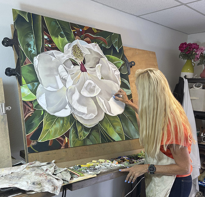
Deb Shea is a visual artist of floral wonder. Shea, a colorist currently working primarily with pastels, studied art and design at UC Davis where she began a career as a graphic designer. Shea worked in design and branding for many years before focusing her attention on her own art practice, which includes pastels, fiber arts, and public art murals. We conversed, with intermittent laughter, in her studio at Art Bias and then visited her solo exhibition, From Bud to Bloom, in the Art Bias Gallery.
Nanette: Tell me about your background.
Deb: I studied studio art with Wayne Thiebaud and Roland Peterson. They were great. Thiebaud was an especially wonderful professor, and a very wonderful painter and colorist. I really enjoyed that quite a bit.
I had to work while in school to support myself. I had a scholarship and worked as a graphic designer to pay for my education. I did graphic design for several different agencies in the college: the newspaper, posters for Arts and Lectures, all that kind of stuff. I took that up as my career after I finished school. I was hoping to go to San Francisco Art Institute for graduate school, but I never had enough money. I was paying off my student debt for quite a while. So, I became a designer! I worked for a while in Sacramento, then I moved to San Francisco. I continued to be a designer, then an art director, and then a creative director.
I moved from San Francisco to the peninsula about 30 years ago. I worked for two or three software companies as a creative director. One was based in Oslo, so I was traveling to Norway quite a bit, and two other software companies. I had my own marketing business for about ten years. I was doing artwork as well but primarily designing, illustrating and branding—a lot of branding and identity work, for many kinds of companies.
Then the recession hit in 2008. So, my business really suffered after that. Marketing budgets kind of go by the wayside when you have a real economic crisis.
I started to work full time for a client for about five years. Being a creative director and doing all the illustration and design work for all their packaging.
Nanette: Was that Pamela’s?
Deb: That was Pamela’s. I worked for Pamela for about 25 years altogether. I first started freelancing for her when my daughter was born, and then slowly but surely, her company grew and grew. When I first met her, it was just her and her warehouse manager. So, we went through a lot together! After some years, I had enough of working for a small company and a lot of deadline pressure that was very stressful.
Then I had a bit of a health scare. I got over that but decided it was finally time to dedicate myself to my art full time.
Nanette: Were you engaged in your own personal artwork while you were having a design career?
Deb: I was.
Nanette: Has it always been pastels?
Deb: No. Previously I did a lot of acrylic work and collage work. I did take some courses at the Art Institute in San Francisco. It was wonderful. I did a lot of very large oil paintings and acrylic paintings in those classes.
Nanette: But now you work primarily in pastels?
Deb: Yes primarily. It’s a medium that I started working with for my illustration work, because a client was looking for an artisan feel to the packaging design. So, I started to do pastel drawings. My employer was paying for all my supplies. They said, “Buy anything you want.” That was great, because I got to use really nice stuff. Then I had deadlines, of course. So, I learned to really dive into the medium. I was enjoying it very much, too. That was fun.
Nanette: What is it about pastels that engages you?
Deb: I got some pastels from my grandfather went I was very young. I’ve always been very comfortable in drawing. I really, really enjoy the emotional quality of drawing. I think that was one of the reasons why I kept up with my artwork while I was a designer. There was such a great emotional attachment to touching things rather than working on a computer. I also love to do things in textiles, like knitting, and crocheting, and felting, and that kind of stuff, working with the paper flowers. . . I love making things. So, pastels, I’ve always loved their quality, the velvetiness of them, and the super beautiful colors.
Nanette: The tactile thing—do you feel like you can get your hands into the pastels more than you can with paint?
Deb: Yes. There’s an intimacy that I really enjoy.
Nanette: Your color palettes are just so intense and vivid in a very rich, luscious way.
Deb: I really enjoy that about the medium. I think you can get such stellar color from pastels. There’s just such a purity of pigment with them. Because it’s pure pigment with this little bit of binding agent in there that gives such richness. There are different varieties that have a lot of intensity, and other ones that will be softer, maybe not so intense, but have a velvety quality in their texture.
Nanette: Based on the manufacturer?
Deb: All the brands are very different. One can become a real pastel nerd! These are fluorescence from Henri Roche in Paris. [gestures to different groupings of pastels in her studio] I discovered these in the Sennelier shop across from the Louvre. They have gorgeous, gorgeous color, and they are quite expensive. They have great pigment in them, so you end up not using them as much as some of the others because the color is so rich.
When you’re working in pastel, you’re building the color, so you might use heavier, harder pastels initially. You get the intense highlights or intense colors as you build, so you would use the softer ones later.
Nanette: You mix your brands?
Deb: Yes, all the time.
Nanette: It doesn’t matter what the binding agent is, that’s not an issue you have to pay attention to?
Deb: No, not really. I think you must be mindful of darks and lights. Because with pastels, there’s all this dust, and there are issues with trying to keep that dust at bay while trying to build the colors, so everything is very clean and pretty, and doesn’t get all muddied up. Typically, when you see a pastel person just starting out, they have a hard time with that [dust management], so you’ll see a lot of transfer of color. You must be very mindful as you build. That’s why I like to use pastel boards, because I can rotate my paintings around as I work. That way, I can build from the center out.
This is a commission piece that I’m almost finished with. It is a still life. The silver pieces were my client’s mother’s. Hydrangeas were her favorite flower and she loved lemons. It’s sort of a commemorative piece. They’re hanging it in the dining room, so their mother is always with them.

Nanette: From here, it looks like an oil painting.
Deb: I know, doesn’t it?
Nanette: It has so much precision detail going on which is kind of amazing.
Some of your early work was very popish, like the blueberry pancakes. Was that an influence from working with Thiebaud, or…
Deb: Oh yes, his work was very inspiring to me.
Nanette: But now, you’re primarily doing flowers or commissions, which maybe have additional content. Can you talk about what draws you to the imagery that you’re doing?
Deb: I think part of it is living in this area. I lived in San Francisco for many years, and it was so foggy and cold. I lived out by State College, in my mother’s house. It was so dreary there. I had grandparents that lived in San Mateo, and I would go to visit them. They had a pool, and they had beautiful flowers and gardens, and they were very sweet to me, very kind, my grandmother especially. She taught me how to knit. She was doing projects with her hands all the time, cooking, and making things. So, for me, those were very lovely memories because my family in San Francisco had a lot of strife going on all the time. It was wonderful to be away from that, and to be in a sunny, beautiful area. I have always been drawn to gardens, flowers, and nature. When my husband and I moved here to the peninsula it changed my life. The flowers are subjects that I find very life affirming and wonderful to be around. They influence me a lot.
Nanette: Do your garden?
Deb: Oh yes! I love plants, gardens. We have a place up by Tahoe. It’s beautiful, gorgeous trees, lakes, and mountains are there.
Nanette: Do you see yourself straying or veering away from nature imagery?
Deb: Maybe, I don’t know. I do have some ideas for some different things I’ve been thinking about. The color is the thing that always pulls me back. I love it so much. But you never know. I think you kind of go with something for a long time, and then you feel like, okay, I’m going to do something else now. My earlier pieces were very different. Much more abstract and figurative too. Right now, I’m so happy with what I’m doing and the studio space I have. Some difficulties that I had with my origin family. . . they’ve all passed on. . . that’s sort of behind me now, and I can enjoy my own family, my husband and children, and living in this area. Financially, I am freer to do what I want, more or less, so that’s a great relief, to be able to just concentrate on creativity. I’m so lucky that I get to do that.
Nanette: I’ve never heard someone say my origin family, but I really like that.
Deb: There was just a lot of strife with them all the time. I am at a point in my life now, it is probably my happiest.
Nanette: There are some Buddhist traditions that believe that we choose to go into different family situations so that we can have different experiences to grow and evolve. That our spirits need to have all of the experiences. That’s kind of like a cycling up, which I find to be a lovely way to look at it, because then you’re like, I can do something with this.
Deb: I also think going through difficulties like that gives you a lot of empathy towards people who have struggles and who don’t have a wonderful outlet, like being an artist, or being able to work towards something that really pulls you away from all of it.
My family was full of very creative people, but they had a lot of problems unfortunately. You know, an artist is a sensitive person. You really must find your way through things, because it affects you deeply.
Nanette: Is your upbringing part of why you volunteer with CORA? Please tell us about that.
Deb: I would say yes for sure. CORA stands for Community Overcoming Relationship Abuse. I have worked on an exhibition of art called Uplift with the women artists of Art Bias. This is to celebrate and support the strength of women in their journeys to change their lives in the face of great difficulty. Currently this exhibit is in the CORA offices, and I am hoping to hang some work in the safe houses as well.
Nanette: So back to the technical thing of nature, flowers, and pastels. Are the pigments all naturally produced? Are there pigments that are produced in a lab to get certain colors?
Deb: Oh, I’m sure, yes.
Nanette: I’m wondering, because when I’m looking at flowers, especially their blossoms. It seems to me that there’s every color. But is there every color, naturally?
I’m wondering about the relationship between the pigments in the pastels and the reality of nature. I know that what we see visually is very much influenced by the physicality of an individual’s brain and chemistry. I’ve heard someone say that a yellow was orange without being color blind.
So, what do you think about that? The reality of color in the natural world, in relationship to the colors you get with pastels?
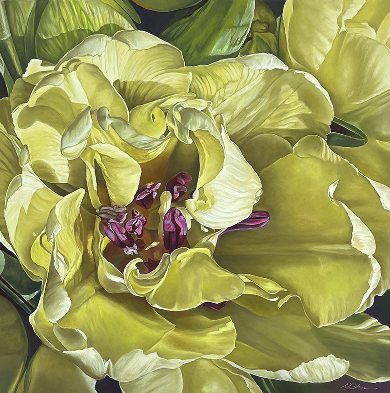
Deb: That’s interesting. I think that as an artist you are looking through your own lens, and so with flowers that I work on, especially more recently, I definitely add a lot to it. I sort of feel like I’m going to take it a little bit further. It’s almost like Mannerism, in a way. You know, we’ve got this ideal of beauty, and then we’re just going to tweak it a little bit. You put your own stamp on it, like every artist does. But the colors are just so fabulous. I can’t help not wanting to use color as much as I can.
Nanette: That’s funny, tweaking beauty. That’d be a great name for a show for you.
Do you work from photographs?
Deb: I start often with a photograph that I’ve set up, then I make it up as I go. The more I work on a piece, the further and further it will stray from the photo. I’m always trying to figuring out how to make it better.
Nanette: You’ve probably been doing it long enough that you could do it without a photographic reference, unless it was a new flower.
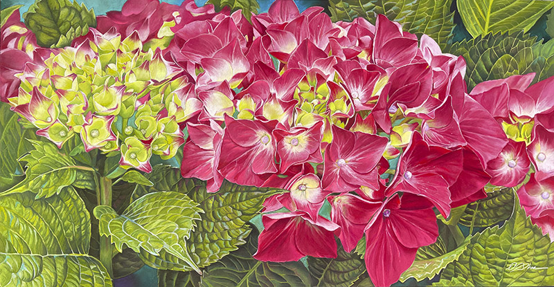
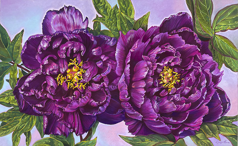
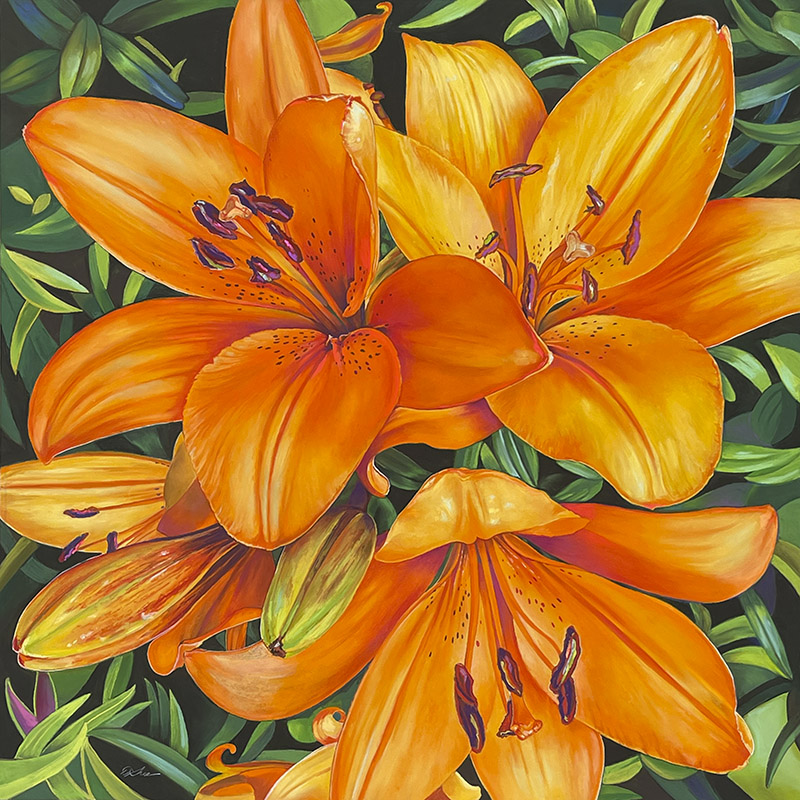
Deb: Yes. I get so many people wanting hydrangeas. I feel like I’m doing hydrangeas in my sleep! So funny, but always a beautiful challenge. Hydrangeas and poppies are very popular in this area.
Nanette: I understand the poppies, but the hydrangeas are interesting because they have a subtext of being about water because they take so darn much.
Deb: They’re water flowers. That’s what the name means. They’re very popular around here. I know they grow well on the coast, but I see gardens and yards of them everywhere when I’m going out on my runs in the neighborhood. I have had many commissions for them. They’re hard to do, because they’re so intricate. Sunflowers are also challenging! [The first time] I got in the middle of it, and I thought, oh, my God, what have I done? This is so hard! I kept going around and around, and that center part, I couldn’t figure out how to do it for the longest time.
Nanette: But you did it.
Deb: Yes, I did. I broke it down and thought, all right, I’ll just do it like a wedge of that center circle. To figure out the best way to get that color on there, the way I wanted it, and to get the pattern of the spiral. . . I had a real flower I was looking at. . . so I figured it out. But it took a while.
Nanette: This one looks like a drawing. . . or a painting. [gesturing to different works in the studio] Whereas that one, and that one, and that one, and even the pancakes, and this new one, they’re almost photorealism. I am wondering if that was because of the creation timespan or different styles.
Deb: I go back and forth a bit. There’s the new poppy piece in the gallery that I did with oranges and purples. That one is more impressionistic. I guess you could say freer, with the colors in the background.
Nanette: Still really beautiful.
Deb: Thank you. The pastels from Paris, I had to use them again. [laughs] I love to shop at different art supply stores and get inspired. Also yarn and bead shops!
Nanette: I still love bead shops. Things like bead shops close.
Deb: Yarn stores close too! There are no yarn stores anywhere.
Nanette: You have to go up into rural places.
Deb: You do, it’s hard to buy yarn online and it’s never the same. You’ve got to touch the yarn and feel it, got to work for what I need.
Nanette: You’re going to have to get some sheep.
Deb: And a llama. I love lamas.
Nanette: Is there a subtext to this work? The floral work?
Deb: The floral work in general, you mean?
Nanette: Is beauty the primary content?
Deb: I think they’re really about rejuvenation and celebration. Humans use flowers in every significant milestone of our lives. People find joy in my work. If it’s in their home, they say to me “I see the painting in the morning, and it makes me so happy.” That really brings me joy.
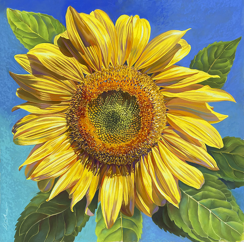
There’s a man I did a sunflower for; he has a solar company that has the word sunflower in French. He commissioned me to do a sunflower for the company’s 30th anniversary. He told me he was going to put it in his conference room, but when I delivered the painting, he said, “You know, I’m going to put this in my office.” He hung it behind him, so when he’s on calls, people see this sunflower. He tells me how much they love the sunflower and how much he enjoys discussing it.
For a guy to tell you that, it’s a pretty big deal, right?
Nanette: Yes, it is. It’s really quite precious.
Deb: I also did a commission for a surgery center in Redwood Shores. The doctor wanted something for the waiting room. This man is a surgeon, a very focused and precise person. I did these very large hydrangea pieces for him. He said to me, “This is one of the best decisions I’ve made for my patients. It gives them something to focus on when they’re kind of scared, or anxious, because they’re going to have their hip or knee replaced.” Isn’t that amazing?
Nanette: Sounds like a good doctor.
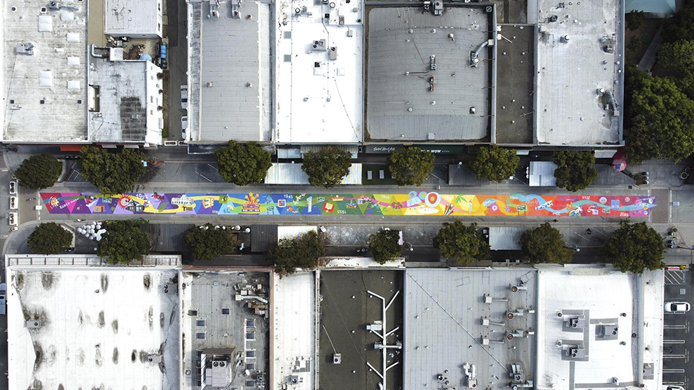
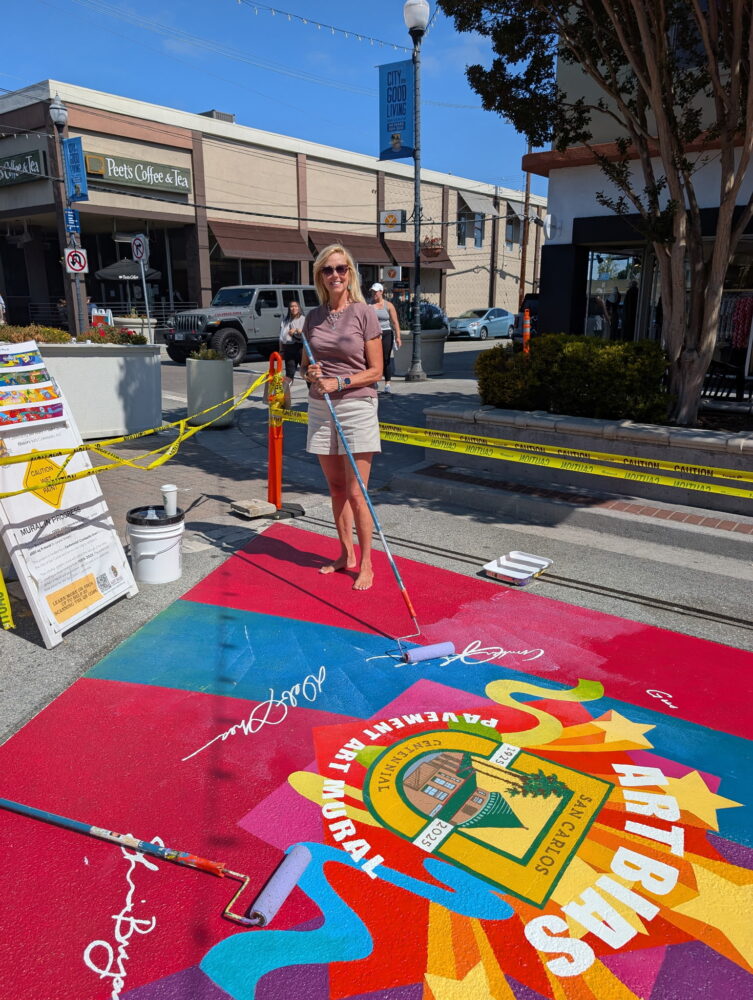
Recently you were the lead on a mural for the city of San Carlos. It’s on the Laurel Avenue pavement. How long is it?
Deb: It’s 373 feet long.
Nanette: Wow. That’s really long. So, what was that experience like?
Deb: It was just a blast. It was wonderful. It’s funny in life sometimes, you have a vision of something, oh, this will be a great experience; and it’s so much better! I loved everything. It was very tiring, and it took a lot out of me, but it was so much fun coming up with the ideas, working on all the graphics, figuring out how to do it, being out there with our team actually painting it every day and then having the folks in San Carlos enjoy it so much!
Nanette: It’s a historic timeline of San Carlos. Did you work that design out on the computer?
Deb: Yes, I did.
Nanette: You were using these magical VR goggles to paint it. I’d never seen anything like that. How did you even find those?
Deb: I was looking online. I saw a couple of muralists, and they were using them. I thought, Wow, that’s just crazy. Look at that, because you’re trying to figure out how to take your design from the computer, and I’ve worked on some big trade show things in the past, so I feel comfortable with large scale, but I’m thinking, I got to get this onto the ground in some way that I can work with it.
We were talking about putting big pieces of paper up on my garage door, and projecting it and cutting it out, and then taking it down, and drawing around as a template. But then I saw these goggles and I mentioned it to Shari [Bryant]. She said, my sister has a ton of those, I will check it out.
Shari troubleshot it. She was able to figure out how to use this program, Stencil, to load in the graphics. I would have a graphic, send it to her, and then she would pull it up and put it in the software. It scales, very large, which you can’t even believe is possible. You project on a surface, you lock the image, and the image pretty much will stay there so you can trace it and then paint in all the details.
The one thing with Laurel Street that we didn’t realize initially is, that road has a curve in the middle. If you’re using the goggles to project an image down, it can get a bit distorted. Sometimes we’d have to finagle it a bit or adjust something to get the image down correctly. But overall, the goggles were magic. It’s why we finished the project early, because we had the goggles it saves so much time. Plus, we felt so much more at ease transferring the images to the road surface and not have to do the paper templates with tape. That would have taken so long and been crazy hard for such a huge project.
Nanette: Did you manage the team as well?
Deb: I would say we all managed ourselves. We had volunteers. We had college age kids as art assistants. They were very good. We all worked on it together. Amber Smith did a lot of research with the San Carlos Museum for imagery and illustrations, and Shari did most of the project management and deck development for presentations. Terra Fuller gets great kudos for helping us with the proposal to the city and my husband Gus was a huge help, too. We had to put out tents every morning to work under because it was so hot. We put a tarp on the mural at the end of every day to keep it as clean as possible before we painted two coats of sealant at the end. Couldn’t have done it without him!
Nanette: How did you get that arial view?
Deb: It’s a drone shot by Phoenix Coulliette. Aaron Alvarez Mendoza also took some wonderful photos of the team working for the San Carlos Living Magazine September issue.
Nanette: One of the things that it really makes me appreciate is the color spectrum.
Deb: I wanted the color to be a knockout! The color triangles also provided a grid for us where we could plot the graphics; instead of a squared grid, we used triangles. I thought the color spectrum would be very celebratory because of the centennial, but also because it would take the viewer through the space naturally along with the big lyrical road image where people can walk along the images in each decade.
Nanette: I bet this is helping you to get more mural commissions.
Deb: Yes, amazing.
I’ll be working on a mural at the Hiller Aviation Museum. They’ve contracted me to do a giant plane in clouds. It’s going to be on one of the big walls. I’m really excited about it.
Nanette: Is Amelia going to be flying it?
Deb: No, but perhaps in something else down the road!
Nanette: When I drive by there, I notice that some of the hangars have women pilot names.
Deb: I know. It is very cool. And they have a wonderful exhibit inside about women flyers. It is really interesting. There were many women.
The mural team—Shari, Amber, and I—are talking to some other groups. I hope we can do some more murals. They are so much fun and bring so much to a dull wall or road. The funding can be very difficult though.
Nanette: It’s funny, and it’s sad.
Deb: It is sad. It’s amazing to me that people say they love art all the time, but yet not support it financially . . . I don’t know what to say about it. It’s just kind of shocking in a way.
Nanette: I just read this article in Hyperallergic about Ireland giving basic income to 2,000 artists. They did a pilot and the program brought in a profit while reducing anxiety.
Deb: What a concept.
Nanette: San Francisco did something similar recently. It was giving something like $1,000 a month to 100 artists. . . apparently artist support helps the economy, and the welfare of the community.
One of the things that I don’t like about some art events is the push to sell. There’s always that uncomfortable question, “Did you sell anything? Are you making your table?”
Deb: I know, the pressure sometimes. It takes away from . . . is that really the important thing, especially at this time of my life? Do I really need to do that, try to sell all the time?
I think as long as I’m enjoying what I’m doing with the commissions and also teaching, that’s wonderful!
Nanette: So, you have other murals in the pipeline, which is really kind of exciting.
Deb: Yes, it is exciting.
Nanette: It’s also a really beautiful thing because you’re not right out of school. You’re having a new career, and you’re being very successful at it.
Deb: Oh, thank you. So nice.
Nanette: Color perception is very individual.
Deb: It is very individual. It’s very cultural, too. It’s interesting, the colors people are attracted to. In Oslo the buildings are painted in these goldy maize colors, brick red colors, and a blue that’s a little dark blue green. Colors you would never see people paint their homes and buildings here. I knew as soon as I was in Norway that it was a different country because of the way they paint the buildings.
Nanette: I wonder if it’s because they have the extremes in daylight and nightlight.
Deb: It makes a big difference. I was in Oslo many times. It was beautiful. And they very much appreciated more artistic kinds of graphic design, things that were a little more thoughtful and emotional. Whereas in Silicon Valley, you know, not so much. . .
Nanette: I’ve heard that about Europe in general. That if you’re an artist, people are respectful and supportive. Here you’re kind of looked down on. When I was an art educator, one of the things that was troubling was young people coming to me and saying, “My parents don’t want me to do art, because they want me to be able to make a living.” How do you deal with that? Because, actually, as an art educator, I was making my living teaching, not doing art. But I had to have that education and practice, to teach. It was really quite a dilemma.
Deb: It is, it is a dilemma.
Nanette: America has very superficial values.
Deb: They really do. I can’t tell you how many women, and some men, but mostly women who have worked in tech their whole lives. Their whole lives, and it’s soul sucking, horrible. They tell me, “I’m so glad to be out of it,” or “I need to do something creative.” They love art classes for the sake of just taking them and doing something different, and it’s very cathartic for them.
Nanette: I think our species is inherently creative to a fault.
Deb: That’s interesting. Yes, I would agree with that. I remember going to see my husband at his office when he worked for Intel first starting out. He was in internal audit. I would visit him there, and it was very cute, because he had a little cube, and he had my artwork up all over the walls. He was like the wild man of finance, right? [laughs] No art on the walls there.
Nanette: You were part of the branding for Art Bias when it changed from Art Center of Redwood City and San Carlos. How did you come up with Art Bias? Were you working with other people?
Deb: There was a group of us; the people on the board were very involved. They did a lot of work on the mission statement before I joined the board. I had just started the transition from commercial work to become an artist full time. We decided the organization needed a new name and a new logo to become more recognizable. I came on as the marketing chair because I could help with the process with my experience.
We worked on everything for a year. We went through hundreds of names. One of the criteria was to have something that would have its own URL, that would be kind of interesting, and maybe a little offbeat, so it would be more memorable.
Nanette: How did you come up with Art Bias as the name, and then the divided brain as the logo?
Deb: I think we thought that it was fun, and again, memorable. It was about creativity in people, and how we had a bias for art and art by us, too. It has a double meaning. We thought, there’s a bias for art. That’s what we’re about. We want to be a champion for artists. That was in the early part of this organization, at least from my perspective, where it was initialing about empowering artists. Not as much about community outreach in those days; more about supporting artists that were not being supported. We had educational programs just for artists, workshops about social media, art practice, how to approach a gallery, how to maintain a portfolio, and how to frame, things like that, more nuts-and-bolts kind of things for artists. When Jeanette and Terra came on, the focus evolved to include more of an outreach to the community, which has truly been wonderful to be a part of. All the classes we have now are truly incredible.
Nanette: Tell me how you came up with the brain logo because it’s really a risky logo.
Deb: I did a lot of logo idea designs, and that was the one that we all agreed on. I can’t even remember how many I pitched! We wanted something that would be memorable, celebratory, and expresses the creativity that artists feel, the right side of the brain. That side of the brain is about art bias. It was for artists and all the great ideas for bringing art to community.
Artists need support and encouragement. It can be very challenging, and Art Bias has certainly been that for me and many others.
I left the board after I finished that project.
Nanette: Oh, really?
Deb: Yes, I did. Well, I was ill, but then I also decided I had probably enough of working on boards. Too many meetings! I do like to still do projects for organizations that mean a lot to me. Recently I painted a new façade for Art Bias to help others find us and identify what we are and all that we have to offer. It is very colorful and stands out as folks go by walking or driving by. My husband, again was a great help, and I am very proud of it. It was my joy to do!
Nanette: Volunteering can have challenges, especially if you have to work with someone who’s not nice.
Deb: Somebody that’s not nice, or they want to argue all the time.
Nanette: I think it’s because in addition to being creative to a fault, our species has this thing that we think that the stuff that’s in our brain is true and correct. When, you know, it’s just stuff going through.
Deb: That so funny. I would always tell people, we’re going to do this logo and this branding, and this is not going to be in your house! This is for a business, and we are thinking in a business direction and it’s a business decision. Here are your competitors. Here is what they’re doing. Here’s how the perception is. Here’s how we want to be perceived. It is difficult for folks to realize the importance in developing materials that are meaningful for the intended audience.
Nanette: You’re also teaching, and you’ve been teaching at the Georgia O’Keeffe Museum, which I visited in Santa Fe, and is awesome. Any thoughts or anecdotes about teaching?
Deb: I just love it. It’s so much fun. I’m teaching online. I am teaching two-part courses now, which is terrific and getting more students. It’s going well. I think people are really interested in pastels. Then I’ve been going on site to teach at the museum in Santa Fe. I was there twice last year, and will be twice this year, maybe even a third visit. So that’s really been a wonderful example of another experience for my art. I get to also explore my relationship with Georgia O’Keeffe, who meant so much to me since the first time I saw her when I was nine years old.
Nanette: The first time you saw an O’Keeffe you were nine?
Deb: Yes. I went with my fourth-grade class to see her work at the De Young Museum. My teacher was really into art. He was very encouraging to me in my artwork too. I went and I saw her paintings. I just couldn’t believe how beautiful they were.
I think maybe it was my dad that bought me that book about Georgia that came out in ’76, that big book and I just thought it was wonderful. I loved it so much. Then, years and years later, I was thinking, the Georgia O’Keeffe Museum. . . I wonder. . . I saw they had classes. I wondered if they had any pastel classes. No, no pastel classes. Interesting. So, I put together a proposal for them, and I sent it off. I didn’t hear anything. I thought, oh well it’s not going to happen. But wait. They contacted me, and they said, “we got your proposal, and we’re excited, and we would love to talk to you about teaching.” I just couldn’t believe it. What a miracle, right? So, there you go. Just never know sometimes.
Nanette: It’s exciting.
Deb: Yes. Terrific. They’re building a new museum now. They broke ground last year, and every time I’ve gone there, I see more progression. I was talking to the educational manager I work with, and asked, “Will there be murals in that big building?” And she said, “I don’t know but wow, maybe.” I told my husband, I’d do a mural for free there. I would do it for free.
You never know. I feel like my whole second career here has been “you never know.” It’s been wonderful. I would have never thought I would do the things I’ve been doing. Especially a project like the Laurel Street mural, that was so big and incredible. Also teaching pastel classes in-person here at Art Bias.
Nanette: Let’s go look at your solo exhibition in Studio 114, From Bud to Bloom.
You have some other artists showing with you. Who was Glenn Dickson?
Deb: Glenn Dickson was my uncle.
Nanette: Your uncle was an artist?
Deb: Yes. He went to the Chicago Art Institute, and they have one of his paintings. He became a professor at DuPage in Glenn Ellyn, Illinois. He worked as an illustrator and an artist.
Nanette: Who is Barbara?
Deb: Barbara was my mother. Alan Dickson was my father. They met studying art at San Jose State in the early ’60s and got married soon after. This is her little sketch of me, and my dad’s sketch of me. My mother didn’t finish school until later. She finished her degree at San Francisco State in Interior Design. They were very artistic people.
All these art pieces, plus a lot more, were always in my home, growing up. [Deb gestures to a selection of artwork on the wall that is not hers.] Here is a little article about them, the Family of the Week. That’s me. That’s her painting on the wall. And our cat. They bought a house in San Ramon, and the newspaper there did little write ups of the new families. My mother is 22 there, and my dad was 26 and working graveyard at Continental Can company as a lithographer, and so the irony, of course, is six months after this photo, they broke up and got divorced. [laughs]
But isn’t that a little capsule of this 1960s family?
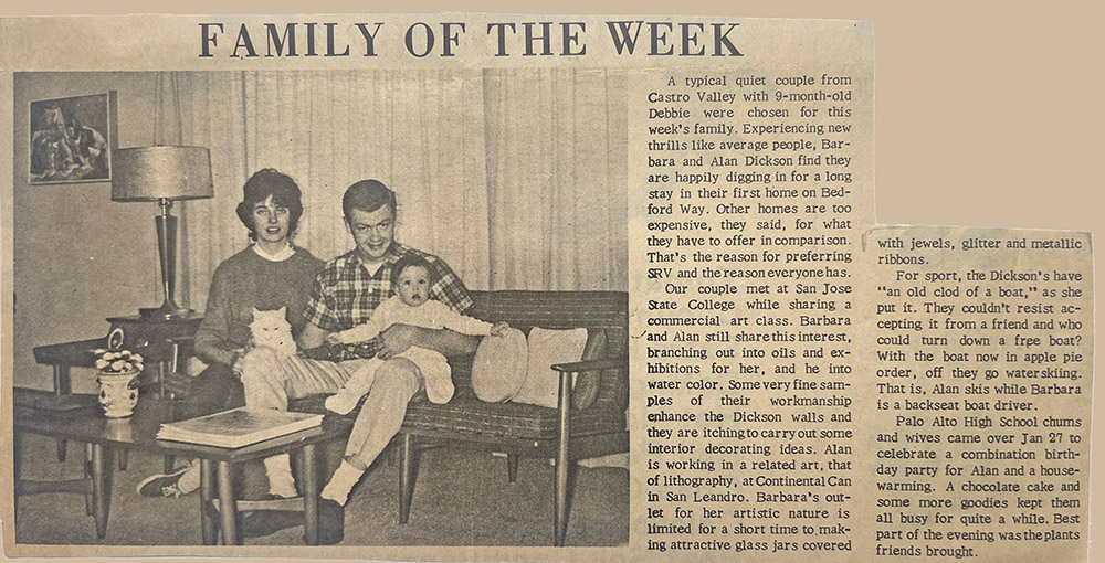
Nanette: The furniture is really 1960s.
Deb: My mother is just in shock and awe right there, thinking, what have I done?
Nanette: So, you’ve included this as part of your history?
Deb: Yes.
Nanette: Your art is such a contrast to these pieces which are very muted, soft, traditional.
Deb: Yes, right.
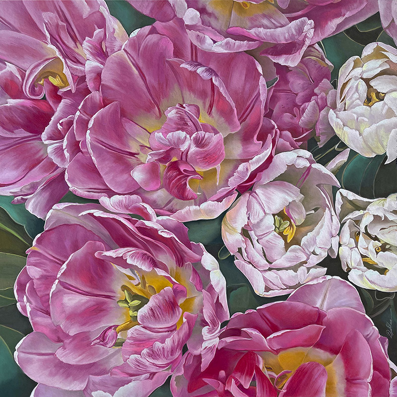
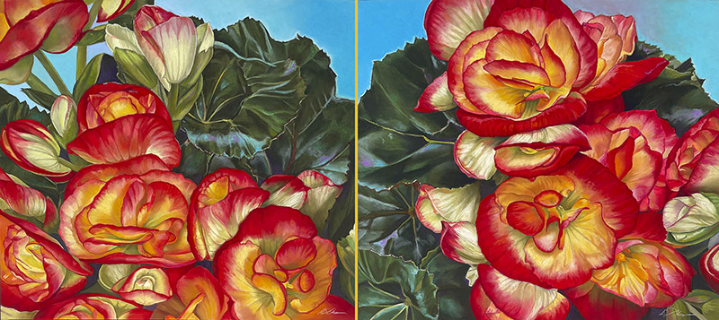
Nanette: And these begonias, they’re incredible. They’re all kind of incredible, Deb, because they’re so vivid. You know, a lot of people do flowers, but your floral work. . . they are so much about looking, and there’s this intensity of joy that comes out of them, which doesn’t happen for everything. There’s a real intense joy.
Deb: I think there’s so many levels of intense joy when I work on them, and for me, to create something extraordinary is just, magic. Working with a medium that I love so much. Then also, creating them for the world, so people can see them and enjoy them as well!
All those things together just make it a wonderful experience for me. Being here, having my studio, space, being able to work like this. It’s my dream come true. I’m relishing it at this point. You know, my life, especially with all that’s happened, and the influences that I had. Especially when I was doing the mural, I thought, gosh, I really wish my dad was here to see this. He would have gotten such a kick out of seeing me do this project. Because he was probably my biggest creative influence. He was very talented, and he had a great eye for stuff. He’d appreciate this. He was always very into what I was doing and would sit down with me and draw. I think he would have been so excited about what’s happened, and how much I’ve been able to do with the time that I’ve had here. It’s so special.
It’s interesting when you work on something that you get so much emotional joy from and putting it out into the world and then thinking about somebody buying it and taking it to their home. It’s almost like you really don’t want to sell them. You know, you’d rather just keep everything.
I’m very happy, and I feel like I just want to keep going, and see what directions come my way. What do you think?
Nanette: I look at these and I think, Wow. They are so much about joy. It’s really wonderful to be in a space with a lot of them, in a white cube space.
Deb: Others have told me that. The colors really come out [in this space, the gallery].
Nanette: There’s something about that palette. Well, it’s a primary palette, but you don’t think of it as a primary palette.
Deb: Right, right.
Nanette: It’s really stunning,
Deb: Thank you.
Deborah Shea website
Interview with Deborah Shea by Nanette Wylde, March 2026.